
It was July 2024, and the USD/NGN chart was a mess of conflicting signals.

Olumide Adeyemi
West African Trading Pioneer ·  Nigeria
☕ 12 min read
What you'll learn:
- 1What Exactly Is a Forex Heat Map?
- 2Why This Tool is a Game-Saver for Nigerian Traders
- 3How to Read and Interpret the Colors
- 4How to Integrate It Into Your Trading Routine
- 5Pitfalls and Common Mistakes (I've Made Them All)
- 6Where to Find a Reliable Heat Map in Nigeria
- 7Advanced Tactics: Confluence with Other Tools
- 8Final Word: It's About Context, Not Certainty
It was July 2024, and the USD/NGN chart was a mess of conflicting signals. The Naira was weakening on the official market, but whispers from the parallel market told a different story. I was staring at my charts, trying to decide if the dollar had more room to run. Then I flipped to my forex heat map. A sea of deep red engulfed the USD column. Every major currency - EUR, GBP, JPY, even the AUD - was showing strong selling pressure against the dollar. That single visual told me the USD's broad strength was real, not just a Naira story. It saved me from a nasty counter-trend trade. That's the power of this tool: it cuts through the noise of individual pairs to show you the underlying currents.
Forget complicated definitions. A forex heat map is a simple, color-coded grid that shows you which currencies are strong and which are weak, right now. Think of it like a weather map for money. Instead of temperatures, you see momentum.
It typically lists major currencies (USD, EUR, GBP, JPY, CAD, AUD, NZD, CHF) along the top and side. Each cell in the grid represents a currency pair. The color of that cell - usually shades of green for strength and red for weakness - tells you the price action's intensity.
If the entire USD row is dark green, it means the dollar is buying up everything in sight. If the EUR column is bright red, it means the euro is being sold against all its counterparts. This instant, visual snapshot is why it's so valuable. You're not analyzing one pair in isolation; you're seeing the entire battlefield.
Example: Let's say your heat map shows:
- USD: Dark Green
- JPY: Light Red
- EUR: Light Green This tells you the USD is the strongest, the JPY is the weakest, and the EUR is mildly strong. The clearest trend? Buying USD/JPY aligns with the strongest currency against the weakest.
Most heat maps use a calculation of percentage change over a specific period (like the last 5 minutes, 1 hour, or daily) to determine the color. The key is understanding it shows relative strength, not an absolute buy/sell signal. It's a context tool, not a crystal ball.
Our market has unique layers. We're watching the official CBN rate, the parallel market rate, and then the major forex pairs like EUR/USD that influence global sentiment. It's easy to get lost. A heat map cuts through that complexity by focusing on one thing: pure inter-currency momentum.
Spotting Real Trends vs. Naira Noise
When the Naira is under pressure, it's tempting to think every dollar pair is a one-way bet. A heat map shows you if the USD is actually strong globally, or if the Naira's move is isolated. In early 2024, when the USD/NGN was soaring, there were periods where the heat map showed the USD was actually weak against the Euro and Pound. That was a warning that the Naira move might be overextended and due for a correction. Trading EUR/USD long during those times would have been profitable, while blindly buying USD/NGN was riskier.
Finding the Cleanest Trade
You want to trade with the trend, not against it. The heat map makes finding the dominant trend effortless. Is the commodity bloc (AUD, CAD) showing uniform strength? Maybe oil or copper is driving it. That's a clearer signal than trying to interpret a wobbly AUD/USD chart alone. It helps you pick the pair with the highest probability momentum, which is crucial for strategies like scalping where every pip counts.
Managing Correlated Risk
Many Nigerian traders, myself included, have been burned by not realizing how correlated our positions are. If you're long GBP/USD and long EUR/USD, you're making the same bet twice: that the dollar will fall. A quick glance at a heat map shows that - if the USD column is green, you're fighting the trend on both trades. It's a instant risk check.

💡 Winston's Tip
A heat map shows you who's winning the war. Your job is to find the cleanest battlefield to fight on, not to fight on every front.
“A heat map cuts through the noise of individual pairs to show you the underlying currents.”
Don't just look for green and red. You need to read the intensity and the pattern.
Color Intensity Matters: A pale green cell means mild buying. A forest green or even blue cell (on some maps) means aggressive, high-momentum buying. The same goes for red. The darkest colors show you where the real institutional money is flowing. That's where you want to align.
Look for Uniformity: The most powerful signals come from uniformity. When every cell in a currency's row and column is the same color, that's a consensus. For example, if USD is green across its row (USD strong vs. others) and also green down its column (others weak vs. USD), that's a unified market selling everything for dollars. That's a high-confidence environment.
Watch for Divergence: This is where you find reversals. Say the EUR/USD chart is hitting a new high, but the heat map shows the EUR's green color is fading to light green or even turning pink while USD red is lightening. That's a divergence. The price is up, but the underlying momentum is waning. It's a classic warning sign that the move is tired.
I learned this the hard way in 2023. GBP/JPY was ripping higher, and I jumped in late. The chart looked bullish, but the heat map showed the GBP's green was fading fast, and the JPY's red was turning to light orange. I ignored it, thinking the chart knew best. The pair reversed and took out my stop loss for a 1.5% account loss. The heat map saw the exhaustion before the chart did.
Warning: A heat map is a lagging indicator. It's based on price changes that have already happened. It confirms strength; it doesn't predict the future. Never enter a trade based solely on a pretty color pattern. Use it to confirm setups from your primary strategy.
You don't build a strategy around a heat map. You use it to filter and improve your existing strategy. Here’s my simple 3-step routine.
Step 1: The Market Context Scan (Pre-Market Open) Before I even look at a specific chart, I open my heat map. I set it to a 1-hour or 4-hour timeframe to see the short-term momentum. I ask: What's the strongest currency? What's the weakest? Is there a clear theme (e.g., risk-on with AUD, NZD green; risk-off with JPY, CHF green)? This 30-second scan sets the tone for my entire session. It tells me which pairs are likely to be trenders and which are likely to be choppy.
Step 2: Trade Selection & Filtering Let's say my strategy gives me a buy signal on EUR/USD. I check the heat map. If the USD is a deep, uniform red (weak) and the EUR is a solid green (strong), that's a strong confirmation. The trade aligns with the broader momentum. I might even consider a larger position size (within my risk rules, of course). If my buy signal appears but the heat map shows USD is green and EUR is weak, I treat that signal with extreme suspicion. I might pass on the trade entirely, or use a much tighter stop loss.
Step 3: In-Trade Management While in a trade, I periodically glance at the heat map. Is the strength/weakness pattern holding? If I'm long AUD/USD and I see the AUD's green start to fade across the board, it might be time to tighten my stop or take partial profits. It helps you manage greed. That strong green won't last forever.
For Nigerian traders using platforms like MT5, many heat maps are available as custom indicators or through websites like TradingView. The best ones update in real-time.
“You want to trade with the trend, not against it. The heat map makes finding the dominant trend effortless.”
This tool is simple, which makes it easy to misuse. Here's where traders, including a younger, dumber version of me, blow up.
Mistake 1: Chasing the Hottest Color. You see the USD turn nuclear green and immediately slam a market order on USD/JPY. By the time you're filled, the move is often over, and you're buying the top. The heat map showed you the momentum that got it there. Remember, it's lagging.
Mistake 2: Ignoring Timeframes. The 5-minute heat map might show EUR is red. The daily heat map might show EUR is solidly green. Which one matters? It depends on your trading style. A scalper cares about the 5-minute. A swing trader must respect the daily. Always check the heat map on the timeframe you're trading. I once got chopped up scalping because I was using the daily heat map trend against the 1-minute chart action.
Mistake 3: Treating It as a Standalone System. This is the biggest killer. A heat map doesn't show support/resistance, it doesn't account for news events, and it doesn't manage your risk. I know a guy who lost two prop firm challenges because he traded purely off a heat map reversal. He saw USD turn from green to pink and went all-in short on every dollar pair. A surprise Fed comment sent the dollar soaring again, and he got a margin call on all positions simultaneously. He had no other analysis.
Mistake 4: Overcomplicating It. You don't need to calculate the exact hex code of the green. Is it generally strong or generally weak? That's your question. Is the pattern uniform or mixed? That's your analysis. Don't get lost in the shades.
💡 Winston's Tip
If the heat map is a uniform mess of light colors with no clear leader, that's the market telling you to sit on your hands. Volatility without direction is a money shredder.
You don't need a fancy, expensive terminal. Here are the practical ways Nigerian traders access this tool.
TradingView: This is my personal go-to. Many Nigerian traders are already on TradingView for charting. Their 'Currency Strength Meter' widget is a heat map. You can add it to your chart layout. The free version has limited indicators, but the paid plans offer it. It's reliable and updates well.
MetaTrader 4/5 Custom Indicators: Search the MT4/MT5 Market or forums for 'Currency Strength Meter' or 'Forex Heat Map'. Many are available for free or a small fee. You load them onto a chart, and they display the grid. The quality varies, so test them on a demo first. The advantage is having it right inside your trading platform.
Dedicated Forex Websites: Sites like Myfxbook, Investing.com, and FXStreet have heat map tools on their websites. These are free to access. The downside is they're not integrated into your platform, so you have to switch windows.
Broker-Specific Tools: Some brokers like Exness or IC Markets might integrate a strength meter into their advanced web platforms or offer it as part of a premium service. It's worth checking your broker's toolkit.
The key is to find one that updates quickly (low latency) and is visually clear for you. I'd recommend starting with TradingView's tool if you already use it, as the integration is seamless.
Pro Tip: Whatever tool you choose, keep it consistent. Don't switch between different heat maps during your trading day, as they may use slightly different calculations. Pick one, learn its nuances, and stick with it.
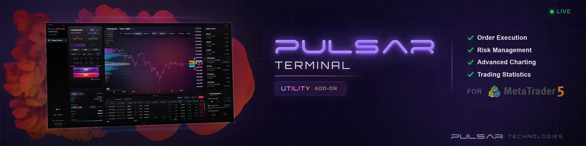
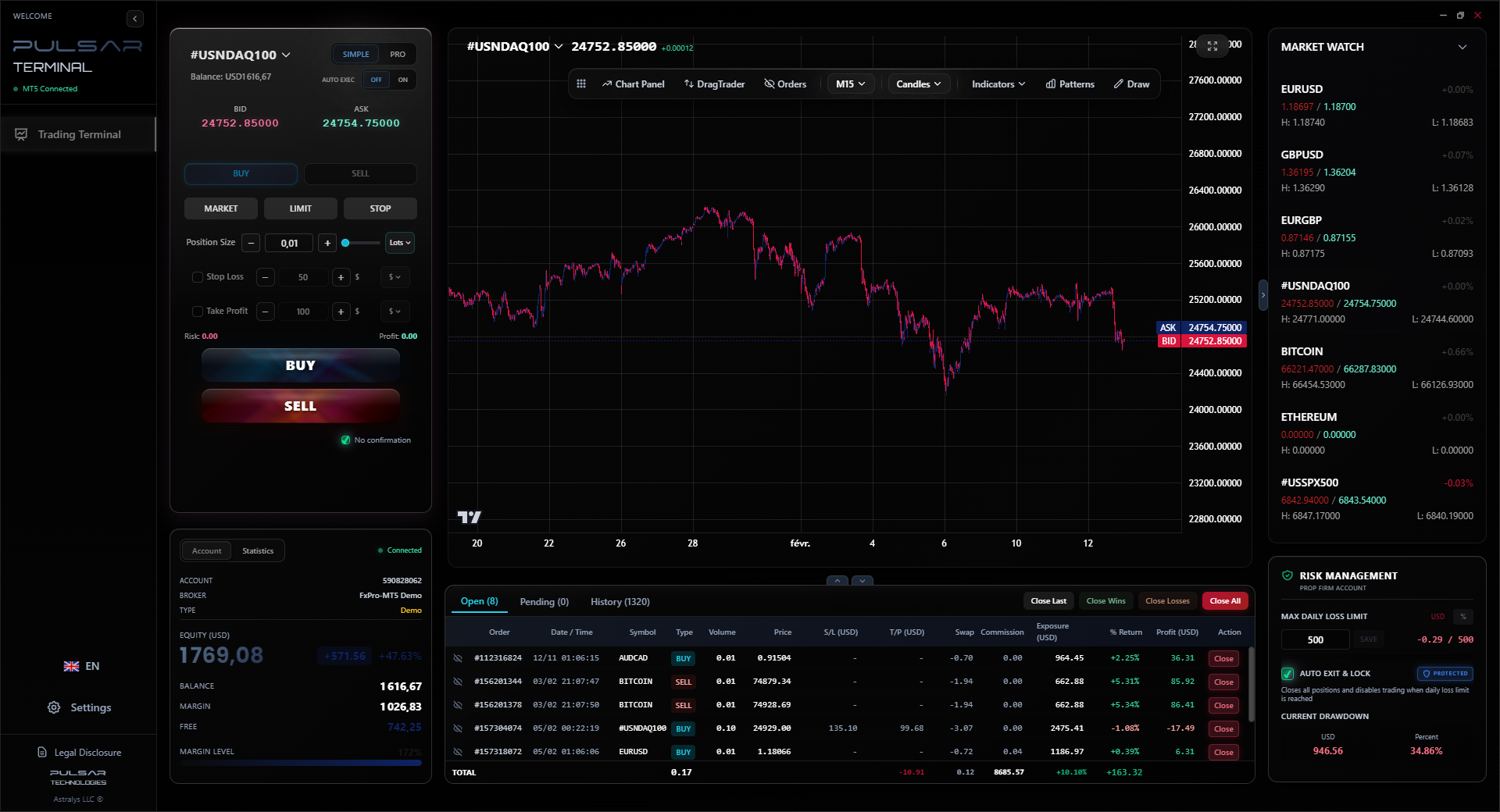
When your heat map confirms a strong trend, tools like Pulsar Terminal let you execute multi-level orders and trailing stops on MT5 instantly, so you can ride the momentum without hesitation.
Pulsar Terminal
The all-in-one MT5 companion: drag-and-drop orders, multi-TP/SL, trailing stop, grid trading, Volume Profile, and prop firm protection. Used by 1,000+ traders daily.
“It's a lens that brings the market's true forces into focus. And in a game where most traders are blurry-eyed, that focus might just be the edge you need.”
This is where the magic happens. A heat map alone is okay. A heat map combined with other tools is powerful.
Confluence with Price Action: This is my bread and butter. I wait for a key price action signal - like a pin bar at a major support level on GBP/USD. Before I take it, I check the heat map. Is the GBP showing strength (green) or at least stopping its weakness (red turning to white)? Is the USD showing weakness (red)? If the heat map confirms the price action story, that's a high-probability entry. If they disagree, I walk away.
Confluence with the MACD Indicator: The MACD shows momentum and trend on a specific pair. Use the heat map to explain why that momentum is happening. If EUR/USD MACD is turning bullish, and the heat map shows EUR strength is broad-based (not just against USD), it suggests a stronger, more sustainable move.
Confluence with Economic News: Let's say US Non-Farm Payroll data smashes expectations. The USD column on the heat map will likely light up green. Watch the intensity and duration. A flash of green that fades in 15 minutes is a knee-jerk reaction. A sustained, deepening green over the next hour suggests a genuine shift in sentiment. This helped me after a recent CBN rate decision; the initial Naira strength faded on the heat map within an hour, telling me not to trust the first spike.
Using it for Pair Selection in Swing Trading: For longer-term trades, I use the weekly heat map. I look for currencies that have sustained strength or weakness over multiple weeks. That currency becomes my focus. I then look for technical entries on pairs involving that currency. It ensures I'm swimming with the major tide, not against it.
💡 Winston's Tip
The daily heat map is your compass. The 5-minute heat map is your speedometer. Don't use your speedometer to navigate a cross-country trip.
A forex heat map won't make you a profitable trader overnight. No tool will. What it does is solve a specific problem: it gives you instant, visual context for the chaotic forex market.
For the Nigerian trader, navigating a complex local and global landscape, that context is priceless. It helps you distinguish a global dollar move from a local Naira crisis. It stops you from putting on three trades that are all the same bet. It gives you the confidence to pass on a technically okay setup that goes against the grain of broader market momentum.
Start simple. Add a heat map to your screen. For a week, don't trade with it. Just observe it. Watch how the colors shift around major news. See how strong trends manifest as uniform colors. Notice how reversals often start with a divergence.
Then, slowly, use it as a filter. Let it improve your process. It's a lens that brings the market's true forces into focus. And in a game where most traders are blurry-eyed, that focus might just be the edge you need. Just remember, it's one lens in your toolbox - not the whole workshop.
FAQ
Q1Is a forex heat map free to use?
Yes, many reliable versions are free. Websites like Investing.com and FXStreet offer free browser-based heat maps. TradingView includes a currency strength meter in its paid plans, but you can find similar free indicators in the MetaTrader marketplace. You don't need to pay a premium for the basic functionality.
Q2What's the best timeframe to set on a heat map?
It must match your trading style. Scalpers should use a 1-minute to 15-minute heat map. Day traders should use 1-hour or 4-hour. Swing traders should primarily use the daily and weekly heat maps to identify the dominant multi-day trends. Always check that the heat map timeframe aligns with the charts you're trading.
Q3Can I use a heat map to trade USD/NGN directly?
Not directly, because a standard forex heat map only includes the major global currencies (USD, EUR, JPY, etc.). The Naira (NGN) is not included. However, you can use it indirectly. If the heat map shows the USD is extremely strong across the board, it adds context to USD/NGN strength. Conversely, if USD is weak globally but USD/NGN is rising, it suggests the move is driven by specific Naira weakness, which is crucial information.
Q4How is the color calculated on a heat map?
Most heat maps calculate the percentage price change of each currency against a basket of the others over a specific period. For example, if the EUR has risen 0.5% against the USD, 0.3% against the JPY, and 0.4% against the GBP over the last hour, its average strength score is positive and it will be shaded green. The intensity of the color is based on the magnitude of that average change.
Q5My heat map and my RSI indicator are giving opposite signals. Which one should I trust?
They measure different things. The RSI measures whether a single pair is overbought or oversold. The heat map measures a currency's broad strength against all others. A pair can be overbought (high RSI) while its underlying currency is still broadly strong (green on heat map). In this case, the heat map suggests any pullback might be shallow. Trust your primary entry signal first, but use the heat map to assess the strength of the underlying trend and manage your risk accordingly.
Q6Are there heat maps for other markets like stocks or crypto?
The concept exists elsewhere but is less common. In stocks, you might see 'sector heat maps' showing which industry groups are strong/weak. For crypto, some sites offer 'coin heat maps' showing Bitcoin's strength against altcoins. The forex market, with its symmetrical pairs (EUR/USD, USD/JPY), is uniquely suited to this grid-style visualization.
Prof. Winston's Lesson
Key Takeaways:
- ✓Use the heat map for context, not as a standalone signal.
- ✓Align your trades with the darkest, most uniform colors on the grid.
- ✓A divergence between price and heat map momentum is a major warning sign.
- ✓Always match the heat map's timeframe to your trading style.
How useful was this article?
Click a star to rate
Weekly Trading Insights
Free weekly analysis & strategies. No spam.
About the Author
Olumide Adeyemi
West African Trading Pioneer
One of Nigeria's most active forex trading educators. 8 years of experience trading from Lagos. Specializes in low-capital strategies and prop firm challenges for African traders.
Comments
Risk Disclaimer
Trading financial instruments carries significant risk and may not be suitable for all investors. Past performance does not guarantee future results. This content is for educational purposes only and should not be considered investment advice. Always conduct your own research before trading.
You Might Also Like

Cara Trading Forex Sukses: 7 Prinsip dari Trader Profesional
Cara trading forex sukses dengan 7 prinsip trader pro: manajemen modal, disiplin, journal trading, backtest. Data nyata, bukan janji profit palsu.
Jam Trading Forex Terbaik untuk Trader Indonesia: Panduan Lengkap dengan Tabel Waktu
Panduan jam trading forex untuk trader Indonesia. Tabel 4 sesi dunia, jam emas 20:00-00:00, sesi mana yang harus dihindari. Data akurat + tips dari trader berpengalaman.
Top 5 Sàn Forex Uy Tín Nhất 2026: Review Jujur dari Trader Indonesia
Top 5 sàn forex uy tín 2026 untuk trader Indonesia. Review jujur: spread, deposit, withdraw, dukungan lokal. Exness, XM, IC Markets & lebih.
Get Pulsar Terminal
All these calculators are built into Pulsar Terminal with real-time data from your MT5 account. One-click position sizing, automatic risk management, and instant calculations.
Get Pulsar Terminal