
I remember staring at my screen in 2016, watching the GBP/USD chart after the Brexit vote.

Olumide Adeyemi
West African Trading Pioneer ·  Nigeria
☕ 10 min read
What you'll learn:
- 1Why Charts Matter (Especially in Nigeria)
- 2Candlestick Basics: The Alphabet of the Market
- 3Timeframes: Getting the Context Right
- 4Support & Resistance: The Market's Memory
- 5Trends and Trendlines: Riding the Wave
- 6Common Chart Patterns: The Market's Blueprint
- 7Volume & Basic Indicators: The Supporting Cast
- 8Putting It All Together: A Nigerian Trader's Checklist
I remember staring at my screen in 2016, watching the GBP/USD chart after the Brexit vote. It was pure chaos. The line was a jagged cliff, dropping over 1,800 pips in minutes. My friend in Lagos had a sell order at 1.3500, thinking he was clever. The price spiked to 1.5018 before collapsing, wiping him out before it even hit his target. That was the day I learned that a chart isn't just a picture; it's a story of fear, greed, and mass psychology. If you don't know how to read forex charts, you're just gambling. Let's fix that.
In Nigeria, we trade in a unique environment. The Naira's volatility against the dollar isn't just a chart pattern for us; it's the price of rice, fuel, and school fees. Reading a chart isn't an academic exercise here. It's a survival skill. With the new SEC rules under the ISA 2025, the game is changing. Platforms need to be registered, which is good for cleaning up the space, but it doesn't make the charts any easier to read. A solid understanding of price action is your first line of defense against scams and your own emotions. I've seen too many guys in Abuja and Port Harcourt blow accounts because they followed a 'signal' without understanding the chart it came from. The chart tells you what is happening. The news (or WhatsApp rumours) tells you why it might be happening. Always trust the chart first.
Warning: The 10% Capital Gains Tax (CGT) applies to your trading profits. That chart showing your glorious winning trade? Mentally slice 10% off the top immediately. It changes your real risk-reward math. A 50-pip win isn't 50 pips after CGT and spreads.
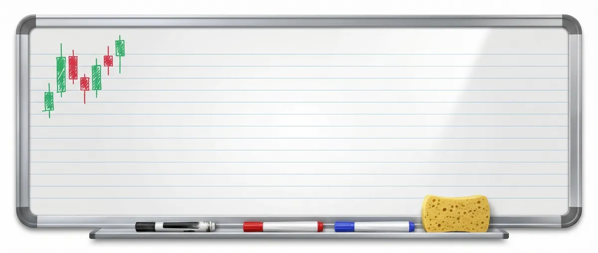
Forget line charts. You read forex charts with candlesticks. Each stick tells a mini-story of the battle between buyers and sellers in a specific time frame - whether it's 1 minute, 1 hour, or 1 day.
The Anatomy of a Candlestick
A candlestick has a body and wicks (or shadows). The body shows the opening and closing price. If the close is higher than the open (a bullish candle), the body is often green or white. If the close is lower than the open (a bearish candle), it's red or black. The wicks show the highest and lowest prices reached during that period.
A long bullish body means buyers were in strong control. A long bearish body means sellers dominated. A small body (a doji) shows indecision - a tug-of-war where neither side won. I once sat through a 4-hour session on EUR/USD where it printed a series of dojis right at a major support level. It was boring as hell, but that indecision was the signal. It broke upwards, and I caught a 120-pip move. The quiet charts often scream the loudest.
Pro Tip: Switch your chart to 'Heikin Ashi' candles occasionally. They smooth out the noise and make trends crystal clear. It won't give you precise entries, but it'll stop you from selling in a strong uptrend just because of one red candle.

💡 Winston's Tip
A chart is a record of past auctions. Your job isn't to predict the future, but to assess the current auction's strength and place a smart bet on its probable direction.
“In Nigeria, reading a chart isn't an academic exercise. It's a survival skill.”
This is where most new traders in Nigeria fail. They jump on a 5-minute chart, see a green candle, and buy. They're ignoring the bigger picture. You need to read forex charts on multiple timeframes.
Think of it like a map:
- Weekly/Daily Chart (The Country Map): Shows you the major trend. Is the overall market moving up, down, or sideways? If the daily chart is screaming bearish, why are you looking for buys on the 15-minute chart? You're fighting the tide.
- 4-Hour/1-Hour Chart (The State Map): Shows you the intermediate swings and key support/resistance levels.
- 15-Minute/5-Minute Chart (The Street Map): This is for fine-tuning your entry and exit. This is where you execute.
My process is top-down. I find the trend on the daily. I identify a key level on the 4H. Then I wait for my entry setup on the 1H or 15M. Ignoring this is how I lost $400 on USD/NGN pairs a few years back. The daily was in a brutal downtrend (Naira weakening), but I got cute trying to scalp a bounce on the 5-minute chart. The bounce lasted three candles before it resumed its plunge. The bigger timeframe always wins.
Using a position size calculator is non-negotiable, and your size should be informed by the volatility you see on the higher timeframes, not just your account balance.
Prices don't move in a vacuum. They remember. Support is a price level where buying interest is strong enough to overcome selling pressure, causing the price to stop falling. Resistance is the opposite. These levels are the backbone of technical analysis.
They aren't magic lines. Think of them as price zones where a lot of transactions happened before. The more times price touches a level and reverses, the stronger that level becomes. When price finally breaks through a strong level, that old resistance often becomes new support (and vice versa).
Drawing these levels is more art than science. Don't just connect exact wicks. Look for areas where price has repeatedly stalled or reversed. Use a rectangle tool to highlight the zone. In early 2023, Gold (XAU/USD) bounced between $1800 (support) and $1950 (resistance) for months. Buying near $1800 and selling near $1950 was a license to print money until it wasn't. The break above $1950 was explosive. I missed the first part of that breakout because I was stuck in the range mentality. That's a lesson: respect the breakout more than the range. For more on trading gold, our XAU/USD guide breaks down its unique quirks.
“A cluttered chart leads to a cluttered, confused mind.”
The oldest rule in the book: 'The trend is your friend.' It's also the most ignored. A trend is simply the direction the market is moving. An uptrend makes higher highs and higher lows. A downtrend makes lower highs and lower lows.
A trendline is a diagonal support or resistance level. In an uptrend, you draw a line connecting the higher lows. In a downtrend, you connect the lower highs. The trendline is valid as long as price respects it. A break of the trendline is often the first sign the trend is weakening.
But here's my controversial take: Most retail traders draw trendlines wrong. They force them to fit. A valid trendline needs at least two touches, preferably three. The angle matters too. A trendline that's too steep (like 70 degrees) will break quickly. A gentler slope (around 30-45 degrees) is more sustainable. I wasted months in my early career trying to trade off badly drawn, steep trendlines. The MACD indicator can help confirm if trend momentum is still present, but the price action on the chart is the ultimate truth.
| Trend Type | What to Look For | Common Mistake |
|---|---|---|
| Strong Uptrend | Long green candles, small pullbacks | Trying to short every top |
| Strong Downtrend | Long red candles, weak bounces | Trying to 'buy the dip' too early |
| Ranging/Sideways | Price bouncing between clear S&R | Assuming a breakout will happen immediately |
💡 Winston's Tip
If you can't clearly see the trend within three seconds of looking at a chart, walk away. No trend means no edge. Go drink a Chapman instead.
Patterns are recurring shapes that suggest what might happen next. They're not guarantees, but they increase probabilities.
Continuation Patterns (The Pause):
- Flags & Pennants: Small consolidation after a sharp move. The expectation is a continuation in the original direction. These are great for adding to a winning position.
Reversal Patterns (The Turn):
- Head and Shoulders: A classic top pattern. Left shoulder, higher head, right shoulder. The neckline break is the sell signal. I caught a perfect one on BTC/USD in 2022 that led to a 40% drop. The target is roughly the distance from the head to the neckline, projected downward.
- Double Top/Bottom: Price tests a high/low twice and fails. The break of the middle point (the 'neck') confirms it.
Patterns work because they reflect shifts in market psychology. A double top shows buyers failing twice at the same level, exhausting their power. Remember, a pattern isn't confirmed until the key level (neckline, pattern boundary) is broken. Trading the anticipated breakout is a sure way to get faked out. Tools like Pulsar Terminal's pattern recognition can scan for these, but you must still learn to see them yourself.
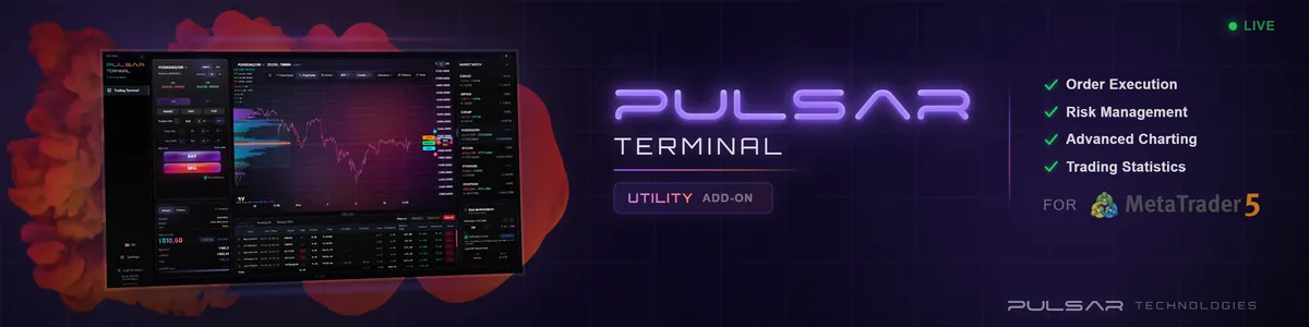
Manually drawing trendlines and patterns on every chart is slow. Pulsar Terminal's drawing tools and pattern recognition scan your markets in seconds, so you can focus on the trade, not the artwork.
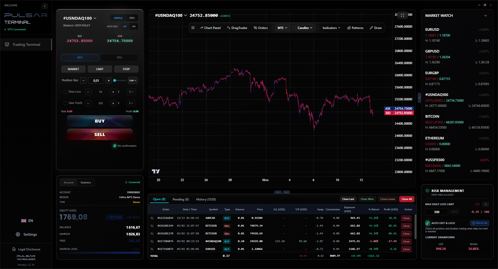
Pulsar Terminal
The all-in-one MT5 companion: drag-and-drop orders, multi-TP/SL, trailing stop, grid trading, Volume Profile, and prop firm protection. Used by 1,000+ traders daily.
“Always trust the chart first.”
Price is king, but volume is the power behind the throne. Volume confirms the strength of a move. A breakout on high volume is more likely to be real than one on low volume. Unfortunately, in the decentralized forex market, we don't get true volume, we get 'tick volume' (the number of price updates), which is a decent proxy.
As for indicators, keep it simple. You don't need 20 squiggly lines on your chart. They all derive from price anyway.
- Moving Averages: These smooth out price action to show the trend. The 50-period and 200-period are watched by everyone. Price above them = bullish bias. Price below = bearish. A 'Golden Cross' (50 MA crossing above 200 MA) and 'Death Cross' are big, slow signals.
- RSI (Relative Strength Index): Measures momentum. Above 70 = potentially overbought. Below 30 = potentially oversold. The key is that in a strong trend, RSI can stay overbought or oversold for a long time. Don't short just because RSI hits 71 in a raging bull market. I use it more for spotting divergences (when price makes a new high but RSI makes a lower high), which can warn of weakening momentum. Our guide on the RSI indicator explains this in detail.
Example: You see GBP/USD break above resistance. Look at the volume bar on that breakout candle. Is it the biggest volume bar in the last 20 candles? If yes, the breakout has conviction. If it's puny, be suspicious - it might be a fakeout.
So, how do you actually read forex charts before placing a trade? Here's my personal checklist, refined after a decade of mistakes.
- Determine the Macro Trend: Open the daily chart. Are we making higher highs? Use a simple 50-period MA. Price above it = don't look for sells.
- Find the Key Level: Zoom to the 4H chart. Where is the nearest major support or resistance? That's your trade's target or invalidation point.
- Wait for a Signal: On the 1H or 15M chart, wait for price to approach that key level. Look for a reversal candlestick pattern (like a pin bar or engulfing candle) or a consolidation breakout.
- Check for Confluence: Does your signal align with the daily trend? Is there a trendline or a moving average also at that level? More confluence = higher probability.
- Manage the Trade: Your stop-loss goes beyond the key level. Your take-profit targets the next key level in the direction of the trend. Use a position size calculator so your risk is never more than 1-2% of your account.
This isn't a get-rich-quick scheme. It's a process to stack probabilities in your favour. When choosing a broker to execute this, you need one with reliable charts and fast execution. I've had good experiences with IC Markets for their raw spreads and Pepperstone for their platform stability. Avoid any 'broker' that calls you unsolicited from a number you don't know - that's the first chart you need to read: the scammer flowchart.
FAQ
Q1What is the best timeframe for beginners in Nigeria to start with?
Start with the 4-hour chart. It's slow enough to not be noisy like the 5-minute, but it still shows clear trends and key levels. It forces you to be patient. Once you're consistent on the 4H, then you can use the 1H for better entries. Avoid the 1-minute and 5-minute charts until you have solid discipline; they are casino slots for traders.
Q2How do I know if a support or resistance level is strong?
Look for three things: 1) The number of touches. Three or more touches make it strong. 2) The time frame. A level on the weekly chart is stronger than one on the hourly. 3) The price reaction. Did it reverse sharply (a long wick) or just pause? A sharp rejection shows stronger buying/selling interest.
Q3Are Heikin Ashi candles better than normal candlesticks?
Better for one thing: identifying the trend. They filter out noise and make trends visually obvious. They are worse for pinpointing exact entry and exit prices because the open/close is averaged. I use them on my secondary chart to keep my trend bias clear, but I execute on normal candlestick charts.
Q4With the new SEC rules (ISA 2025), should I only use Nigerian brokers?
Not necessarily. The ISA 2025 requires platforms operating in Nigeria to register with the SEC. Many reputable international brokers (regulated in the UK, Australia, Cyprus) still accept Nigerian clients. The key is they must now comply with Nigerian law to market here. Your priority should be a broker with strong external regulation, tight spreads, and a reliable platform. Do your due diligence on any broker, local or international.
Q5How many indicators should I have on my chart?
Fewer than you think. I know traders making money with just price action and horizontal lines. Start with one or two. A moving average (like the 50 EMA) for trend and the RSI for momentum is more than enough. A cluttered chart leads to a cluttered, confused mind. You're reading the market, not a spaceship dashboard.
Q6What's the biggest mistake Nigerian traders make when reading charts?
Trading against the higher timeframe trend. They see a little dip on the 15-minute chart in a strong daily uptrend and jump in to short it, trying to catch the top. It's like trying to push a moving train backwards. The daily trend will crush those small counter-trend moves 80% of the time. Always know what the bigger picture is saying.
Prof. Winston's Lesson
Key Takeaways:
- ✓Trade the higher timeframe trend or don't trade at all.
- ✓Support/Resistance are zones, not precise lines.
- ✓Volume confirms the breakout's truth.
- ✓Candlesticks show the battle; the wicks tell the story.
- ✓Risk no more than 2% per trade, always.
How useful was this article?
Click a star to rate
Weekly Trading Insights
Free weekly analysis & strategies. No spam.
About the Author
Olumide Adeyemi
West African Trading Pioneer
One of Nigeria's most active forex trading educators. 8 years of experience trading from Lagos. Specializes in low-capital strategies and prop firm challenges for African traders.
Comments
Risk Disclaimer
Trading financial instruments carries significant risk and may not be suitable for all investors. Past performance does not guarantee future results. This content is for educational purposes only and should not be considered investment advice. Always conduct your own research before trading.
You Might Also Like

Cara Trading Forex Sukses: 7 Prinsip dari Trader Profesional
Cara trading forex sukses dengan 7 prinsip trader pro: manajemen modal, disiplin, journal trading, backtest. Data nyata, bukan janji profit palsu.
Jam Trading Forex Terbaik untuk Trader Indonesia: Panduan Lengkap dengan Tabel Waktu
Panduan jam trading forex untuk trader Indonesia. Tabel 4 sesi dunia, jam emas 20:00-00:00, sesi mana yang harus dihindari. Data akurat + tips dari trader berpengalaman.
Top 5 Sàn Forex Uy Tín Nhất 2026: Review Jujur dari Trader Indonesia
Top 5 sàn forex uy tín 2026 untuk trader Indonesia. Review jujur: spread, deposit, withdraw, dukungan lokal. Exness, XM, IC Markets & lebih.
Get Pulsar Terminal
All these calculators are built into Pulsar Terminal with real-time data from your MT5 account. One-click position sizing, automatic risk management, and instant calculations.
Get Pulsar Terminal