
When I started trading in 2012, I lost R8,000 in my first month because I was staring at charts without actually seeing them.

David van der Merwe
Emerging Markets Trader ·  South Africa
☕ 13 min read
What you'll learn:
- 1Why Charts Matter More Than You Think
- 2The Three Chart Types You Actually Need
- 3Understanding Timeframes: The South African Context
- 4Candlestick Patterns That Actually Work
- 5Support, Resistance, and Trend Lines
- 6Putting It All Together: A Trade Example
- 7Common Chart Reading Mistakes to Avoid
- 8Your First Chart Reading Routine
When I started trading in 2012, I lost R8,000 in my first month because I was staring at charts without actually seeing them. I was looking at squiggly lines and colourful candles, completely missing the story they were telling. The truth is, 90% of new traders fail not because their strategy is bad, but because they can't properly read the price action right in front of them. This guide isn't about fancy indicators - it's about teaching you how to read forex charts for beginners, specifically through the lens of a South African trader who's made every mistake so you don't have to.
Let's be honest: when you're starting out, charts look like abstract art. But here's the thing I learned the hard way - they're not just pictures. They're a live feed of market psychology, a battle between fear and greed happening in real time. Every candle represents a specific period where buyers and sellers fought for control, and the winner left a mark.
In South Africa, we have a unique perspective. Our market hours overlap with London in the morning and New York in the afternoon, which creates specific volatility patterns on our charts. I used to trade USD/ZAR blindly during our lunchtime, missing that the London close often caused massive reversals. It wasn't until I learned to read the chart's structure that I started seeing these patterns before they happened.
Charts give you context. News might tell you the rand is weakening, but a chart shows you exactly where it's struggling to fall further, where buyers are stepping in, and when the momentum is truly shifting. This is why learning how to read forex charts for beginners isn't optional - it's your foundation. Without it, you're driving at night with your headlights off.
Warning: Don't fall into the indicator trap. I spent my first year loading charts with 10 different oscillators. The chart itself - the raw price action - tells the clearest story. Start there.

💡 Winston's Tip
A clean chart is a smart chart. If you can't see the price action clearly because of 15 indicators, you're not analyzing, you're decorating.
Platforms offer dozens of chart types, but you only need to master three. Seriously. I've tried them all, and these are the ones that actually make you money.
Line Charts: The Big Picture
A line chart connects the closing prices over time. It's simple, clean, and perfect for your first look at a pair. When I'm analyzing USD/ZAR for the week, I start with a daily line chart. It strips away the noise and shows me the overall trend direction without getting distracted by every little wiggle. It helped me spot the long-term downtrend in EUR/ZAR back in 2021 that smaller timeframes were hiding.
Bar Charts: The Detail Oriented Friend
Bar charts (or HLOC charts) show more: the High, Low, Open, and Close for each period. The top of the vertical line is the high, the bottom is the low. The little notch on the left is the open, the notch on the right is the close.
They're useful, but honestly, I moved past them quickly. They give you the data, but they don't make it easy to visualize the battle between bulls and bears in a single glance.
Candlestick Charts: Your New Best Friend
This is where the magic happens. Candlestick charts show the same four prices as a bar chart, but in a way that's instantly readable. The 'body' shows the range between the open and close. If the close is above the open, the body is often green or white (a bullish candle). If the close is below the open, it's red or black (bearish). The thin 'wicks' above and below show the high and low.
A long green body means strong buying pressure. A long red body means strong selling. A candle with a tiny body and long wicks (a 'spinning top') shows indecision. This visual language became my primary tool. I remember a specific trade on GBP/USD: I saw a cluster of long red candles followed by a candle with a very small body at the bottom of the move. That indecision candle, right at a key support level I'd drawn, signaled the selling exhaustion. I bought, and it rallied 80 pips. The chart told the story before the price even moved.
Here’s a quick comparison of what each shows:
| Chart Type | Shows | Best For |
|---|---|---|
| Line | Closing Prices Only | Identifying the core trend |
| Bar (HLOC) | High, Low, Open, Close | Precise price data analysis |
| Candlestick | HLOC with Visual Context | Reading market sentiment & momentum |
“Clutter leads to confusion and paralysis. A clean chart with price and your key levels is 90% of the work.”
This is where most beginners, including my past self, get completely lost. You can view the same USD/ZAR pair on a 1-minute chart or a 1-month chart, and they'll look like two different animals. The timeframe is the 'zoom level' of your chart.
The Multi-Timeframe Approach: I never look at just one. I use three, a method I call 'Triangulation'.
- The High Timeframe (HTF): Daily or Weekly. This tells me the major trend. Is USD/ZAR in a long-term uptrend? I let this chart make the major decision: am I looking to buy dips or sell rallies?
- The Medium Timeframe (MTF): 4-Hour or 1-Hour. This is my strategy chart. Here I look for key support/resistance levels and chart patterns forming within the main trend.
- The Low Timeframe (LTF): 15-Minute or 5-Minute. This is my entry chart. I use it to fine-tune my entry point and set a tight stop-loss.
Local Market Hours Matter: Our timezone is key. The 8:00 AM SAST candle on a 1-hour chart captures the opening of the European markets (London). The 3:00 PM SAST candle captures the New York open. These candles are often the largest and most volatile of the day. I used to get stopped out constantly because I'd set my stops based on midnight volatility, not accounting for these scheduled explosions. Now, I know not to place tight stops right before these major sessions open.
Pro Tip: Align your trading style with your timeframe. If you have a day job, don't try scalping strategy on the 1-minute chart. You'll get murdered. Use the 4-hour or daily for swing trading. It's how I kept my sanity while trading part-time.
There are hundreds of named candlestick patterns. I've tested most of them. About 80% are noise. The following 20% are pure gold and form the core of my reading.
Single Candle Signals:
- The Hammer & Hanging Man: These have small bodies at the top of the range and long lower wicks. The Hammer forms at the bottom of a downtrend (sellers pushed price down, but buyers slammed it back up). The Hanging Man is the same shape but at the top of an uptrend (a warning). I caught a great reversal in Gold (XAU/USD guide) using a hammer on the daily chart.
- The Shooting Star & Inverted Hammer: The opposite. Small body at the bottom, long upper wick. Shooting Star at a top (buyers failed), Inverted Hammer at a bottom (buyers tried).
Two-Candle & Three-Candle Patterns:
- Engulfing Pattern: This is a powerhouse. A large candle's body completely 'engulfs' the previous candle's body. A bullish engulfing after a downtrend is a strong buy signal. A bearish engulfing after an uptrend is a strong sell signal. It shows a complete shift in control.
- Morning Star & Evening Star: A three-candle pattern. For a Morning Star (bullish reversal): 1) A long red candle, 2) a small-bodied candle that gaps down (shows indecision), 3) a long green candle that closes well into the first candle's body. It signals a transition from selling to buying.
My Hard Lesson: Don't trade these in isolation. A hammer at a random spot means nothing. A hammer at a major support level that's also shown on your higher timeframe? That's a high-probability setup. I once lost R2,500 trading a 'bullish engulfing' in the middle of nowhere on EUR/USD. The pattern was perfect, but the location was terrible. The trend on the higher timeframe was still violently down. The chart gave me the signal, but I didn't read the context around it.
💡 Winston's Tip
The most important candlestick is often the one that hasn't formed yet. Don't predict, just observe what the market gives you and react.
“I lost R8,000 in my first month because I was staring at charts without actually seeing them.”
If candlesticks are the words, support and resistance are the punctuation. They give the story structure. A support level is a price zone where buying interest is strong enough to overcome selling pressure, causing the price to stop falling. Resistance is the opposite - a price zone where selling overcomes buying, stopping a rally.
How to Spot Them: Look for areas where the price has reversed multiple times. It's not a precise line; think of it as a zone. On USD/ZAR, R18.50/$ might be a zone that's capped rallies three times over several months. That's strong resistance.
The Key Concept: When price breaks through a level, that level often 'flips' its role. A broken resistance becomes new support. A broken support becomes new resistance. This is how trends are built. I drew a trend line connecting the higher lows on the USD/ZAR daily chart throughout 2023. Every time the price came back to that line and bounced, it confirmed the uptrend was intact. My best trades were buying those bounces.
Drawing Trend Lines: Connect at least two swing lows (in an uptrend) or two swing highs (in a downtrend). The more times the price touches and respects the line, the more significant it is. But here's my confession: I used to draw trend lines on every tiny wiggle. It looked like spaghetti on my screen. Simplify. Only draw the most obvious ones on your medium and high timeframes. The cleaner your chart, the better you can read it.
Example: In early 2024, EUR/USD (EUR/USD guide) was bouncing between 1.0800 (support) and 1.0950 (resistance) for weeks. Selling near 1.0950 and buying near 1.0800 was a reliable range trade... until the support broke. That break was the chart telling you the story was changing from a range to a new downtrend.
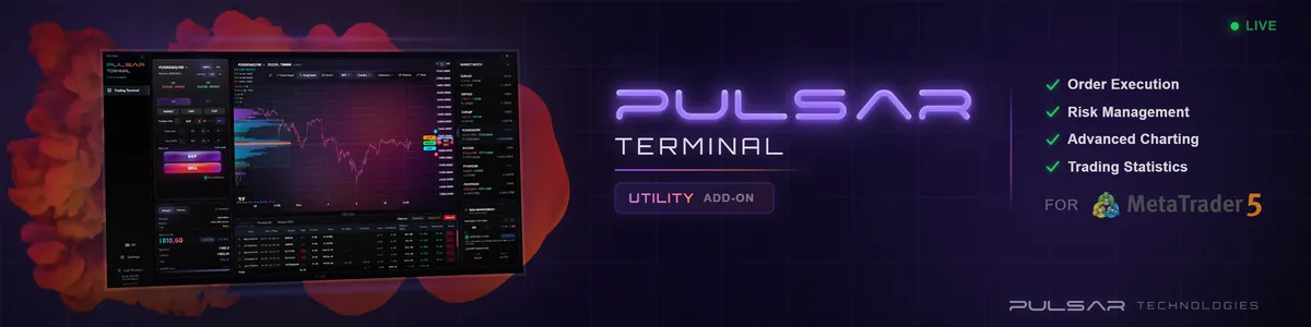
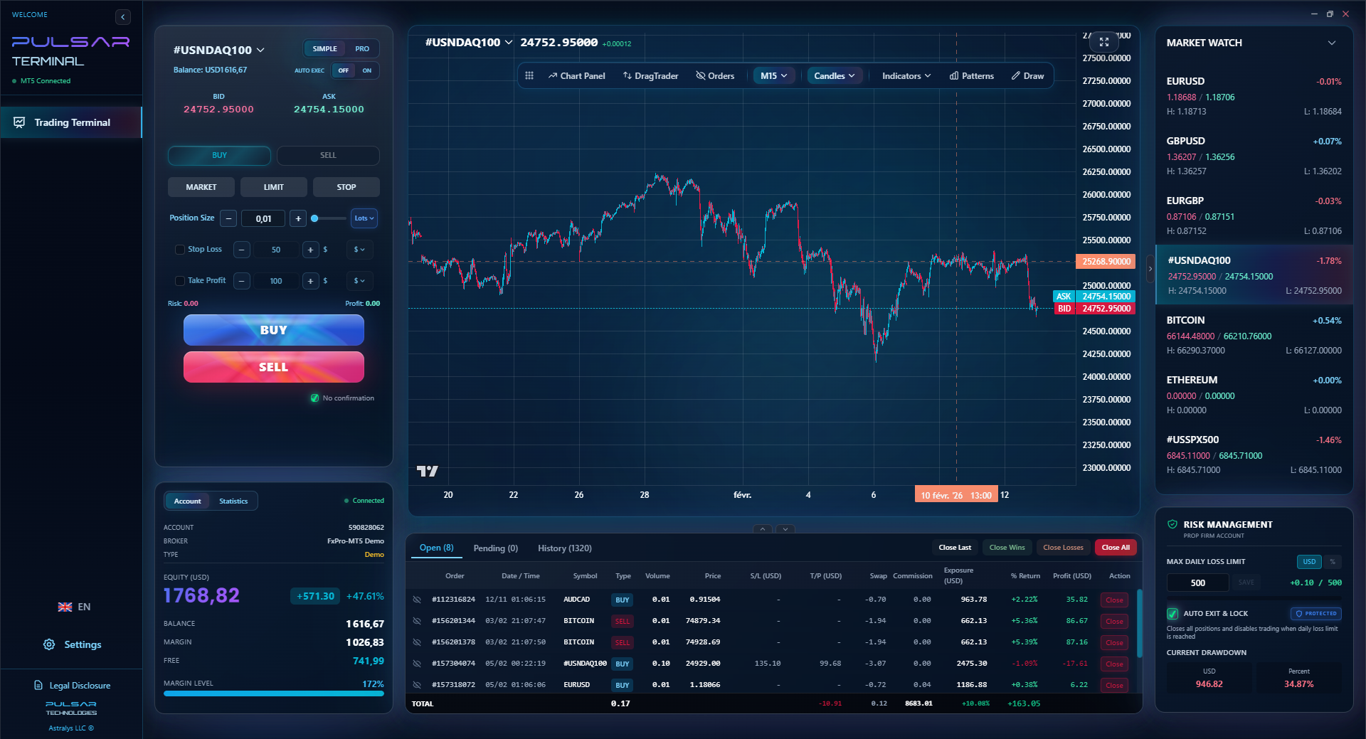
Manually drawing and adjusting trend lines and support zones on every chart is time-consuming; Pulsar Terminal's 20+ drawing tools and pattern recognition automate this directly on your MT5 platform.
Pulsar Terminal
The all-in-one MT5 companion: drag-and-drop orders, multi-TP/SL, trailing stop, grid trading, Volume Profile, and prop firm protection. Used by 1,000+ traders daily.
Let's walk through a real, simplified trade I took on GBP/JPY (a pair with clean trends) using only chart reading.
- The High Timeframe (Daily): GBP/JPY was in a clear, steady uptrend for months. Higher highs, higher lows. Decision: I am only looking for opportunities to buy.
- The Medium Timeframe (4-Hour): Price was pulling back towards a clear support zone that had held twice before. I drew a horizontal line at that support (around 183.00). The pullback was made of small red candles, showing slowing selling momentum.
- The Low Timeframe (1-Hour): Price reached the 183.00 zone. I waited. Then, a clear bullish hammer candlestick formed right on the support line. The next candle was a green engulfing candle. The buyers had arrived.
- The Trade: I entered a buy order at 183.15, just above the hammer. My stop-loss went just below the support zone at 182.70 (a 45-pip risk). My take-profit target was set at the previous high on the 4-hour chart near 185.00.
The Result: The trade worked. Price rallied steadily and hit my target over the next two days. Why? Because every piece of the chart agreed: the trend, the key level, and the candlestick signal. I didn't need an RSI indicator or MACD indicator to tell me. The chart screamed the story.
The flip side? I took a similar setup on USD/ZAR but ignored that the 'support' on the 4-hour chart was actually a minor level. The major daily trend was sideways, not up. The trade chopped around and hit my stop for a loss. The higher timeframe context wasn't strong enough. Lesson: make sure all your timeframes are telling the same story.
“A pattern alone isn't enough. It needs the right context, like a word needs a sentence.”
I've made these so you don't have to. Bookmark this section.
Mistake 1: Overcomplicating the Chart. You don't need 10 moving averages, Bollinger Bands, and a stochastic. A clean chart with price, volume (if available), and your key levels is 90% of the work. Clutter leads to confusion and paralysis.
Mistake 2: Ignoring the Higher Timeframe Trend. This is the #1 reason for losses in my early journal. 'The trend is your friend' is a cliché because it's true. Selling small bounces in a giant uptrend is like trying to stop a train with your bare hands. You might get lucky once, but you'll get run over.
Mistake 3: Treating Support/Resistance as Exact Lines. The market doesn't care about your pixel-perfect line. It's a zone. Give the price some room to breathe. Setting your stop-loss right below support is asking to get picked off by market noise. Place it a sensible distance beyond the zone.
Mistake 4: Chasing the Price. You see a huge green candle and FOMO in. That's emotional reading, not technical reading. By the time the big candle appears, the move is often halfway done. Wait for the price to come back to a level and show you a setup. Patience is a chart-reading skill.
Mistake 5: Not Accounting for the Spread. When you're looking at a 5-minute chart, that 2-pip spread on your broker (check our Exness review or IC Markets review for current spreads) is a huge deal. A doji candle might look like a reversal, but if the spread is wider than the candle's body, the signal is unreliable. Always know your costs, especially when scalping.
💡 Winston's Tip
In South Africa, the 8 AM and 3 PM SAST candles on the 1-hour chart are like the market's morning coffee and afternoon espresso. Pay extra attention.
Here's the exact 10-minute routine I wish someone had given me on day one. Do this every day before you even think about placing a trade.
- Pick One Major Pair: Start with EUR/USD or USD/JPY. They're liquid and have cleaner charts.
- Open the Daily Chart (HTF): Ask one question: What is the trend? Up, down, or sideways? Draw one horizontal line at the most obvious support or resistance you see.
- Zoom to the 4-Hour Chart (MTF): Has the price reached one of those key levels from the daily chart? Is it in the middle of nowhere? Just observe.
- Zoom to the 1-Hour Chart (LTF): Look at the last 10-20 candles. Can you spot any clear candlestick patterns (hammer, engulfing)? Are the candles getting bigger (increasing momentum) or smaller (losing momentum)?
- Write It Down: In a notebook, write: "[Date] EUR/USD: Daily = Uptrend. Price on 4H is near previous resistance (now potential support) at 1.0850. On 1H, showing small candles, indecision." That's it.
Do this for a week without trading. You're training your eyes to see the story. You'll start to notice how price behaves at levels, how trends develop, and where reversals often start. This disciplined observation is more valuable than any indicator. It's how you build the intuition to know when a chart is setting up for a move, which is the ultimate goal of learning how to read forex charts for beginners.
Finally, remember that your broker's platform matters. A clunky interface makes reading harder. I've found platforms from brokers like Pepperstone and XM offer clean, customizable charts which are essential for this kind of analysis. And always, always use a position size calculator before any trade. Reading the chart tells you where to trade; position sizing tells you how much to trade so you live to see another day.
FAQ
Q1What is the best type of chart for a complete beginner?
Start with candlestick charts on a 4-hour or daily timeframe. They give you the perfect balance of visual information (sentiment from the candles) without the overwhelming noise of lower timeframes. Line charts are too simple, and bar charts are less intuitive than candles.
Q2How many timeframes should I look at?
Stick to three to avoid confusion: one high (Daily for trend), one medium (4-Hour for levels and setup), and one low (1-Hour for entry). Looking at too many creates conflicting stories. Looking at just one gives you no context.
Q3What does a 'pip' look like on a chart?
A pip is a single, small incremental move in price. On most major pairs, it's the 4th decimal place (e.g., a move from 1.0850 to 1.0851). On your chart, it's the smallest price increment typically displayed. Understanding pips is crucial for measuring risk and reward. You can learn more in our detailed pip definition guide.
Q4How do I know if a support or resistance level is strong?
Strength comes from repetition and timeframe. A level that has caused the price to reverse 3-5 times is stronger than one touched once. A level visible on a weekly chart is far more significant than one only seen on a 15-minute chart. The more times price tests and respects a zone, the more important it becomes.
Q5Why does the spread matter when reading charts?
The spread is the cost of entering a trade. If you're looking at a 1-minute chart and your broker's spread is 2 pips, a candlestick that's only 1 pip tall is meaningless - the cost is bigger than the signal. Always be aware of the spread definition and choose pairs and timeframes where the price movement is meaningfully larger than the spread.
Q6I see a perfect pattern, but the trade fails. Why?
This happened to me constantly. A pattern alone isn't enough. It needs the right context. Was it at a key support/resistance level? Was the overall trend on the higher timeframe aligned? Was there major economic news due? A perfect hammer in the middle of a strong downtrend is often just a pause, not a reversal. Always read the pattern and its location.
Q7How can I practice reading charts without risking money?
Open a demo account with any major broker and follow the daily routine in this guide. Label trends, draw levels, and identify candlestick patterns. Then, 'paper trade' by writing down your hypothetical entry, stop, and target. Review them a few days later. It's free education that builds muscle memory.
Prof. Winston's Lesson
Key Takeaways:
- ✓Master the 3-timeframe 'Triangulation' method
- ✓Trade candlestick patterns only at key support/resistance
- ✓The higher timeframe trend dictates your bias
- ✓A 2-pip spread can invalidate a 1-pip candle signal
How useful was this article?
Click a star to rate
Weekly Trading Insights
Free weekly analysis & strategies. No spam.
About the Author
David van der Merwe
Emerging Markets Trader
Johannesburg-based trader with 11 years in emerging market currencies. Specializes in ZAR pairs, FSCA-regulated trading, and South African market analysis.
Comments
Risk Disclaimer
Trading financial instruments carries significant risk and may not be suitable for all investors. Past performance does not guarantee future results. This content is for educational purposes only and should not be considered investment advice. Always conduct your own research before trading.
You Might Also Like

Cara Trading Forex Sukses: 7 Prinsip dari Trader Profesional
Cara trading forex sukses dengan 7 prinsip trader pro: manajemen modal, disiplin, journal trading, backtest. Data nyata, bukan janji profit palsu.
Jam Trading Forex Terbaik untuk Trader Indonesia: Panduan Lengkap dengan Tabel Waktu
Panduan jam trading forex untuk trader Indonesia. Tabel 4 sesi dunia, jam emas 20:00-00:00, sesi mana yang harus dihindari. Data akurat + tips dari trader berpengalaman.
Top 5 Sàn Forex Uy Tín Nhất 2026: Review Jujur dari Trader Indonesia
Top 5 sàn forex uy tín 2026 untuk trader Indonesia. Review jujur: spread, deposit, withdraw, dukungan lokal. Exness, XM, IC Markets & lebih.
Get Pulsar Terminal
All these calculators are built into Pulsar Terminal with real-time data from your MT5 account. One-click position sizing, automatic risk management, and instant calculations.
Get Pulsar Terminal