
Most traders in Nigeria think picking chart colors is just about making things look pretty.

Olumide Adeyemi
पश्चिम अफ्रीकी ट्रेडिंग अग्रणी ·  Nigeria
☕ 10 मिनट पढ़ने
आप क्या सीखेंगे:
Most traders in Nigeria think picking chart colors is just about making things look pretty. They copy a setup from a YouTube guru and call it a day. That's a fast track to missing signals and straining your eyes during those long Lagos night sessions. The truth is, your forex chart color schemes are a critical piece of your trading toolkit, as important as your position size calculator. Get them wrong, and you're fighting the market with one eye closed. Let's set the record straight on how to build a chart that works for you, not against you.
This isn't about interior design for your MT5 platform. It's about cognitive load and reaction time. When you're staring at a screen for hours, especially during volatile sessions or power outages when you're relying on a generator, your brain is processing a ton of information. Poor contrast or clashing colors add unnecessary strain. I learned this the hard way. Early on, I used a default black background with bright red and green candles. After a 4-hour session during a Naira volatility spike, I had a pounding headache and had misread three separate doji candles because the colors bled together. I lost about ₦15,000 on a single USD/NGN trade because I sold what I thought was a bearish rejection, but it was just my eyes playing tricks. The right scheme reduces fatigue, helps important patterns (like support/resistance or divergence on your RSI indicator) pop out, and creates a consistent environment where your brain can focus on price action, not deciphering the chart.
Warning: Don't just use your favorite football club's colors. That green might look great on a jersey, but as a candlestick color on a white chart, it can become nearly invisible in certain light. Your setup needs to be functional first, fashionable second.
The Science of Visual Perception
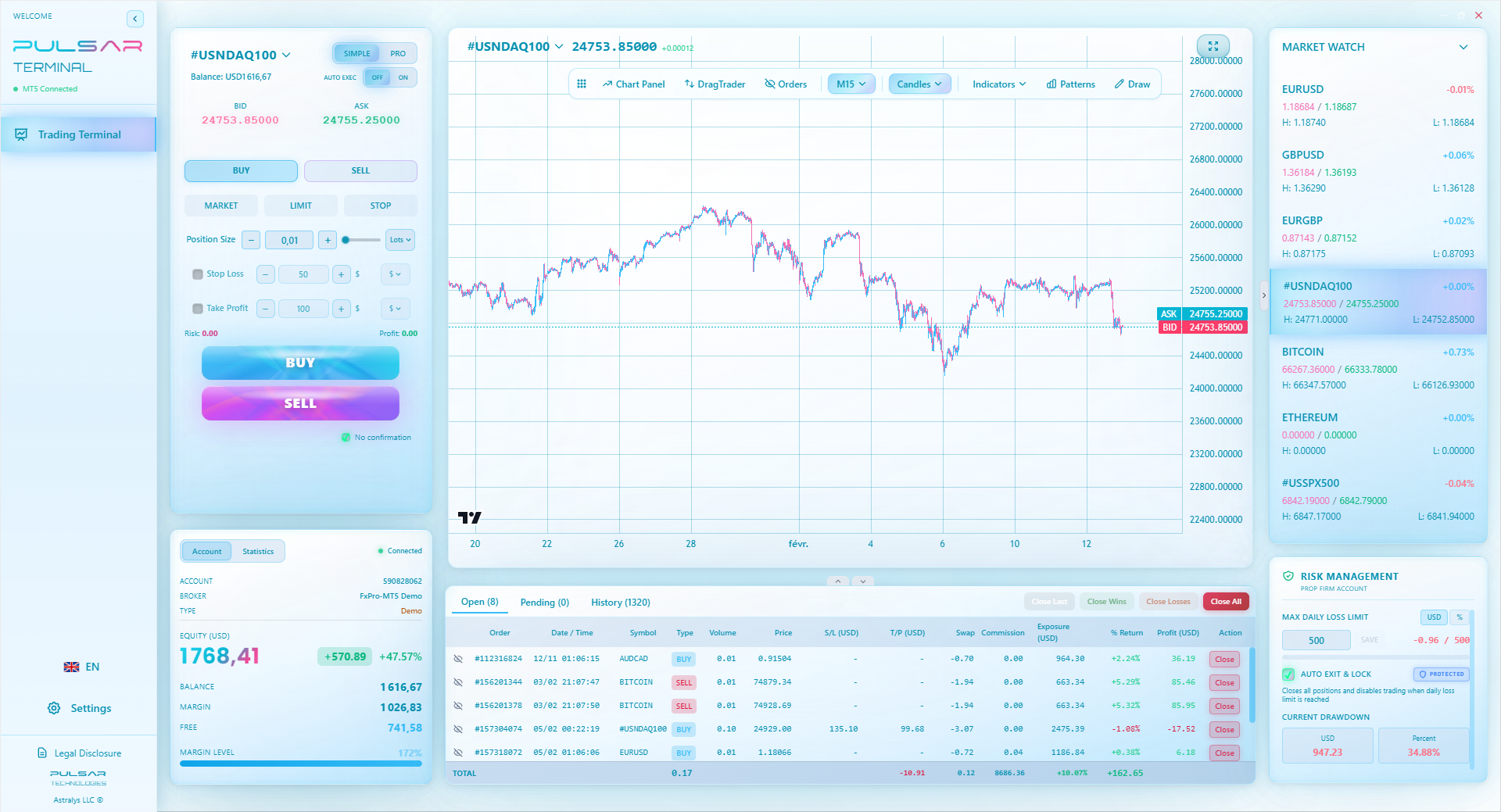
Your eyes don't see all colors with equal clarity. Yellow-green is the easiest for the human eye to see in daylight, which is why high-visibility vests use it. In low light (like your dimly lit trading corner at 2 AM), your rods take over, and you lose color perception, seeing better in shades of grey. A high-contrast scheme helps compensate. This is why many professional traders, even those using advanced tools like Pulsar Terminal for its charting features, stick to classic, high-contrast combinations. They're not boring, they're battle-tested.

💡 विंस्टन की सलाह
If you can't immediately tell if a candle is bullish or bearish from across the room, your contrast is too weak. Crank it up.
Think of this like building a foundation. You need to decide on three core elements: the background, the candlesticks (or bars), and the chart grid/axes. Your choices here dictate everything else.
1. The Background: Dark vs. Light Mode This is the biggest debate. Each has pros and cons for the Nigerian context.
| Dark Background (Night Mode) | Light Background (Day Mode) |
|---|---|
| Pros: Easier on the eyes for night trading, reduces glare, makes colored indicators pop. Saves battery on laptops during 'no light' periods. | Pros: Mimics traditional paper charts, can be better in brightly lit rooms (sunny afternoon in Abuja). Some find trend lines clearer. |
| Cons: Can sometimes reduce contrast for thin lines or subtle patterns. Printing charts (if you do that) uses a lot of ink. | Cons: Can cause eye strain and glare during long sessions, especially at night. Brightness can be overwhelming. |
My verdict? For the majority of Nigerian traders burning the midnight oil to catch London or New York opens, a dark background is usually the winner. It's simply less punishing during those extended sessions.
2. Candlestick Colors: Bullish vs. Bearish The classic is green for up, red for down. But you can flip it. The key is extreme contrast against your background. On a dark background, a pure white (or light cyan) for up and a solid red (or orange) for down works brilliantly. Avoid pastels or colors that are too similar. Your brain should register direction in a millisecond.
3. Grid & Axes: The Invisible Framework These should be visible but not distracting. Use a muted grey (around 30-40% opacity). You want to see the grid when you're looking for it, but you don't want it competing with price action for your attention. A common mistake is using bright white grid lines on a dark chart, which creates a distracting mesh over your data.
“Your forex chart color schemes are a critical piece of your trading toolkit, as important as your position size calculator.”
This is where most traders mess up. They add the MACD indicator, RSI, Bollinger Bands, and a couple of moving averages, and leave each one as the default bright, unique color. The result? A chaotic rainbow that tells you nothing clearly. You need a system.
- Trend-Following Indicators (Moving Averages): Use a sequential, monochromatic scheme. For example, a 50-period EMA in solid blue, a 100-period in a slightly lighter blue, a 200-period in a faint blue. This instantly shows you the hierarchy of trends without color conflict.
- Oscillators (RSI, Stochastic): These often have overbought/oversold zones. Use a strong, alerting color for the zones (like a transparent red for overbought, transparent green for oversold). The oscillator line itself should be a contrasting color that's easy to track, like yellow or cyan.
- Volume: Keep it simple. I use a single color (a neutral grey-blue) for up volume and the same color, but darker, for down volume. The focus should be on the histogram's size, not its color.
Pro Tip: Assign emotional weights to colors. Use 'calm' colors (blues, greys) for background and structure. Use 'alert' colors (reds, bright yellows, greens) only for key signals: your entry markers, your stop-loss line, or a major divergence. When red flashes on your chart, it should mean something critical, not just that the 10-period MA is crossing.
Trading from Nigeria isn't the same as trading from a New York office. Your environment dictates your setup.
Screen Quality & Power: Not everyone has a top-tier, color-accurate monitor. Many are trading on laptops or older screens where colors can look washed out or too saturated. Test your color scheme on the actual device you trade with. Also, during generator use or unstable power, screen brightness can flicker. A high-contrast scheme holds up better under these conditions.
Ambient Light: Trading from a sunlit room in Lagos is different from a dark room in Port Harcourt at night. If you trade in varied lighting, consider creating two presets: a 'Day' scheme with a lighter background and a 'Night' scheme with a dark background. Most brokers like Exness or IC Markets allow you to save chart templates. Use them.
The Mental Load: Our market comes with its own stresses - waiting for forex approvals, managing margin calls with volatile deposits. Your trading screen shouldn't add to the anxiety. A clean, organized, and visually soothing chart scheme is a form of risk management. It keeps you calm and focused when the USD/NGN spread suddenly widens.
💡 विंस्टन की सलाह
Your chart's default color scheme was designed by a software engineer, not a trader. Take ownership of it on day one.
“When red flashes on your chart, it should mean something critical, not just that the 10-period MA is crossing.”
After years of tweaking, here's what works for me, trading mainly Gold (XAU/USD) and EUR/USD (EUR/USD guide) from Abuja:
- Background: Dark charcoal grey (not pure black, to reduce harsh contrast).
- Candles: Hollow candles. White body = close higher than open (bullish). Solid Red body = close lower than open (bearish). This instantly shows momentum strength.
- Grid/Axes: Very dark grey, almost invisible.
- Moving Averages: 50 EMA = Solid White. 100 EMA = Light Grey. 200 EMA = Dashed Dark Grey.
- Key Lines: Long-term Support/Resistance = Solid Yellow. Trendline = Solid Cyan. Stop-Loss = Solid Red line. Take-Profit = Solid Green line.
What Failed Miserably: I once tried a 'price action purist' scheme I saw online: a white background, black candles, and all indicators in shades of grey. It looked minimalist and cool in a screenshot. In practice, during a volatile session, I completely missed a key bullish engulfing pattern because the black candle on white just didn't have enough pop. I was looking for contrast that wasn't there. I also tried using purple and orange for everything, thinking it was unique. It gave me a headache within an hour. Stick to what the eye processes easily.
This setup works whether I'm doing quick scalping or longer-term swing trading. The consistency means my brain isn't relearning a visual language each time I switch timeframes.
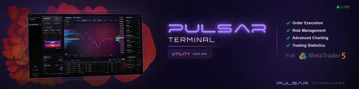
Once you've perfected your chart's look, tools like Pulsar Terminal let you apply that clean visual setup across multiple charts and pairs while adding powerful trade management features directly on MT5.
Don't overhaul everything at once. You'll just confuse yourself. Do this over one trading week.
- Start Fresh: Open a new chart on your platform (be it XM, Pepperstone, or any other). Save your old template as 'Backup' first.
- Set the Canvas: Choose your background (dark or light). Apply it.
- Define the Price: Set your candlestick or bar colors. Ensure the bullish and bearish colors are opposites and clear.
- Tame the Grid: Turn down the opacity and brightness of your grid lines to a subtle level.
- Add ONE Indicator: Add your most important indicator (probably a moving average). Set its color deliberately - not the default. Remove all other indicators for now.
- Trade for a Day: Use this bare-bones chart for a full session. Get used to it. Does the candle color jump out? Is the grid distracting?
- Add Incrementally: The next day, add your next most important indicator. Choose its color with purpose, relating it to your first indicator's color scheme (complementary or monochromatic).
- Repeat until done. This slow build ensures every color has a purpose and you don't end up with visual clutter.
Example: Let's say your main strategy uses the 20 and 50 EMA cross. Make the 20 EMA a bright, solid line (e.g., Yellow). Make the 50 EMA a slightly thicker, but less bright line (e.g., Orange). The cross is now unmistakable - a bright yellow line cutting through a thick orange one. No confusion.
“A clean, organized, and visually soothing chart scheme is a form of risk management.”
Once you have the basics locked down, you can use color more strategically.
Color for Multiple Timeframe Analysis: If you frequently look at the 1H, 4H, and Daily charts for the same pair, use slightly different background tints for each. Maybe a very dark blue for the Daily (the big picture), a neutral dark grey for the 4H, and a dark slate for the 1H. This subconsciously cues your brain to which timeframe you're analyzing, reducing context-switching errors.
Highlighting Market Structure: Use a very specific, rare color only for confirmed major support and resistance levels. I reserve a specific shade of magenta for this. When I see that color on my chart, I know it's a level that has been tested at least twice and held. It immediately commands respect in my analysis.
Session Markers: If you trade session overlaps (like London-New York), use subtle vertical shading on your chart. A very transparent blue for the Asian session, a slightly more opaque green for London, and a red for New York. This helps you visualize where volatility spikes typically occur without cluttering the chart with text. The key is transparency - it should be a faint backdrop, not a dominant feature.
Your forex chart color schemes are a living part of your system. Re-evaluate them every few months. As your strategy evolves, your visual needs might change. The goal is always clarity, reducing cognitive load, and giving your brain the cleanest possible signal from the market's noise.
FAQ
Q1What is the best color scheme for forex trading?
There's no single 'best' scheme, but the most effective ones prioritize high contrast and low eye strain. For most Nigerian traders trading at night, a dark background (charcoal grey) with white/cyan bullish candles and red/orange bearish candles is an excellent, battle-tested starting point. It provides clarity and is easy on the eyes during long sessions.
Q2Should I use green for up and red for down?
It's the global standard for a reason - it's instantly recognizable. However, you can flip it if you prefer. The critical rule is consistency. Don't use green for up on one chart and red for up on another. Pick a scheme and stick to it across all your pairs and timeframes to build reliable visual reflexes.
Q3How many colors should I use on my chart?
As few as possible. You're not painting a masterpiece. Use a maximum of 6-8 distinct colors, with most being variations of a base (like different shades of blue for moving averages). Every added color increases cognitive load. If your chart looks like a rainbow, you've gone too far and are likely distracting yourself from the price action.
Q4Do professional traders use different color schemes?
Yes, but they trend towards simplicity and high contrast. Many prop firm traders use extremely clean, almost monochromatic schemes to eliminate distraction and focus purely on price and volume. The fancy, multi-colored setups are more common among beginners. Pros understand that color is a tool for clarity, not decoration.
Q5Can chart colors really affect my trading performance?
Absolutely. Poor contrast can cause you to misread candlestick patterns or miss key indicator crosses. Eye strain from a bright, cluttered chart leads to fatigue, which impairs decision-making and discipline. A well-designed color scheme is a form of psychological preparation, creating a calm, focused environment for making tough decisions.
Q6How do I choose colors if I am colorblind?
This is crucial. Many platforms offer colorblind-friendly palettes. Instead of relying on red/green, use blue for bullish and orange for bearish, or focus on candle shapes (hollow vs. filled) and contrast in brightness. Use different line styles (solid, dashed, dotted) for indicators instead of just color differences. Test your setup with a colorblindness simulator online.
Q7Should I change my colors for different trading strategies?
Only if the strategies require fundamentally different visual information. A scalper might want higher contrast for tiny candle bodies, while a swing trader might care more about clear long-term trend lines. It's better to have one universal, well-designed scheme that works for all your analysis. Consistency in your trading interface breeds consistency in your execution.
प्रो. विंस्टन का पाठ
:
- ✓Prioritize high contrast over personal color preference.
- ✓Use a maximum of 6-8 distinct colors to reduce cognitive load.
- ✓Dark backgrounds (charcoal grey) are superior for night trading sessions.
- ✓Assign 'alert' colors only to critical signals like stop-loss lines.
- ✓Test your final scheme in your actual trading environment.
यह लेख कितना उपयोगी था?
रेट करने के लिए स्टार पर क्लिक करें
साप्ताहिक ट्रेडिंग विश्लेषण
मुफ़्त साप्ताहिक विश्लेषण और रणनीतियाँ। कोई स्पैम नहीं।
लेखक के बारे में
Olumide Adeyemi
पश्चिम अफ्रीकी ट्रेडिंग अग्रणी
नाइजीरिया के सबसे सक्रिय फॉरेक्स ट्रेडिंग एजुकेटर्स में से एक। लागोस से 8 साल का ट्रेडिंग अनुभव। अफ्रीकी ट्रेडर्स के लिए लो-कैपिटल स्ट्रैटेजीज और प्रॉप फर्म चैलेंजेज में विशेषज्ञ।
टिप्पणियाँ
आपको यह भी पसंद आ सकता है

Cara Trading Forex Sukses: 7 Prinsip dari Trader Profesional
Cara trading forex sukses dengan 7 prinsip trader pro: manajemen modal, disiplin, journal trading, backtest. Data nyata, bukan janji profit palsu.
Jam Trading Forex Terbaik untuk Trader Indonesia: Panduan Lengkap dengan Tabel Waktu
Panduan jam trading forex untuk trader Indonesia. Tabel 4 sesi dunia, jam emas 20:00-00:00, sesi mana yang harus dihindari. Data akurat + tips dari trader berpengalaman.
Top 5 Sàn Forex Uy Tín Nhất 2026: Review Jujur dari Trader Indonesia
Top 5 sàn forex uy tín 2026 untuk trader Indonesia. Review jujur: spread, deposit, withdraw, dukungan lokal. Exness, XM, IC Markets & lebih.
All these calculators are built into Pulsar Terminal with real-time data from your MT5 account. One-click position sizing, automatic risk management, and instant calculations.