
I remember staring at the USD/ZAR chart on October 26th, 2022.

David van der Merwe
उभरते बाजार के ट्रेडर ·  South Africa
☕ 11 मिनट पढ़ने
आप क्या सीखेंगे:
- 1It's Not Just Squiggly Lines: What a Forex Graph Actually Shows You
- 2The Charts We Actually Use: Candlesticks, Heiken Ashi, and Line
- 3Your Graph Analysis Toolkit: Indicators, Drawing, and Volume
- 4A Real-World Example: Analyzing USD/ZAR Step-by-Step
- 5What's Different on a South African Trader's Screen
- 6Graph Analysis Pitfalls I've Fallen Into (So You Don't Have To)
- 7Building Your Consistent Analysis Routine
I remember staring at the USD/ZAR chart on October 26th, 2022. It was trading around 18.35, having just smashed through a support level that had held for weeks. My gut said 'buy the dip,' but the graph told a different story. The volume was screaming, the momentum indicators were in freefall, and the price action had that ugly, panicked look. I ignored the graph, went with my gut, and lost R4,200 in three hours. That day burned a lesson into me: your opinion doesn't matter. The graph's story does. Let's talk about how to read that story properly in our market.
A forex trading graph is a visual story of fear, greed, and collective decision-making. Every candle, bar, or line represents a battle between buyers and sellers at a specific moment in time. For us in South Africa, understanding this goes beyond just watching EUR/USD. You need to see how global flows impact our Rand.
At its core, a price chart shows you three things: direction, momentum, and conviction. Is USD/ZAR trending up because of local political uncertainty or broad dollar strength? Is that spike on EUR/ZAR backed by high volume, or is it a fakeout with thin trade? These are the questions the graph answers.
I used to just look for 'up' or 'down.' Now, I look for why and with how much force. A slow grind higher on low volume is weak. A violent rejection of a price level on huge volume? That's the market shouting. Your first job in forex trading graph analysis is to stop predicting and start listening.
Warning: Don't confuse a pretty line with a trading signal. A graph showing a perfect uptrend on the 1-hour chart could be a minor pullback on the daily. You must analyze multiple timeframes to get the real picture.

💡 विंस्टन की सलाह
A graph doesn't predict the future. It displays probabilities. Your job is to bet when the probability is in your favour and the potential reward outweighs the risk. Never confuse a high-probability setup with a guarantee.
You'll hear about a dozen chart types, but in the trenches, South African traders live on three.
Japanese Candlesticks are the undisputed king. Each candle shows the open, high, low, and close for a period. The body and wicks tell you who won the battle (bulls or bears) and how volatile the fight was. A long green candle closing near its high shows strong buying pressure. A candle with long wicks at both ends but a small body? That's indecision. I rely on candlesticks for all my detailed entry and exit planning. Learning basic patterns like pin bars, engulfing bars, and dojis is non-negotiable.
Heiken Ashi charts are a smoothed-out version of candlesticks. They filter out some of the market 'noise' and make trends crystal clear. When I'm in a swing trade on GBP/ZAR and want to avoid being shaken out by minor reversals, I switch to a Heiken Ashi chart to help me stay in the trend. Just remember, because the calculations are smoothed, the opening and closing prices aren't exact.
Line Charts are for the big picture. I use a simple closing-price line chart on the weekly timeframe to instantly gauge the long-term trend of a pair like USD/ZAR. It cuts through the daily clutter. It's my go-to for the first 10 seconds of analysis on any new instrument.
Which One Should You Use?
It's not either/or. I have all three on my screen. My typical setup: A Heiken Ashi chart on the 4-hour to define the trend, a candlestick chart on the 1-hour for precise entries, and a line chart on the daily in a corner to keep the macro trend in view.
“Your first job in forex trading graph analysis is to stop predicting and start listening.”
A naked chart is powerful, but the right tools turn observation into a strategy. Here’s what’s in my kit.
Trend & Momentum Indicators:
- Moving Averages: I use a simple 50-period and 200-period Exponential Moving Average (EMA). If price is above both, the trend is up. The 50 crossing the 200 (a Golden Cross or Death Cross) is a major trend-change signal. On USD/ZAR, these crossovers can signal moves of 200-300 pips.
- RSI indicator (Relative Strength Index): My primary gauge for overbought/oversold conditions. If RSI is above 70, the pair might be overbought and due for a pullback. Below 30, it might be oversold. I once caught a great reversal on EUR/ZAR at 19.85 after the daily RSI hit 75 and started curling down.
- MACD indicator: Fantastic for confirming trend strength and spotting potential reversals. Look for the MACD line (blue) to cross above the signal line (orange) for bullish momentum, and vice versa.
Drawing Tools: This is where forex trading graph analysis gets artistic. You're mapping the market's memory.
- Support & Resistance Lines: Price tends to bounce or break at previous highs and lows. Drawing these horizontal lines is step one. USD/ZAR, for years, found stiff resistance around 19.50.
- Trendlines: Connect a series of higher lows in an uptrend or lower highs in a downtrend. A break of a strong trendline often precedes a significant move.
- Fibonacci Retracement: After a strong move, price often retraces 38.2%, 50%, or 61.8% of that move before continuing. I use this to find potential entry points in the direction of the main trend.
The Most Overlooked Tool: Volume In forex, we use tick volume or volume from the futures market. It tells you if a price move has conviction. A breakout to a new high on low volume? I'm skeptical. A bounce off support on surging volume? That's a potential signal. Ignoring volume is like listening to a speech with the sound off - you miss the emotion.
Pro Tip: Don't indicator-stuff your chart. I use 2, maybe 3 indicators max. More than that and you'll get conflicting signals and paralysis. Start with price action (support/resistance), add a moving average for trend, and the RSI for momentum. That's a complete system.
Let's walk through how I analyzed USD/ZAR last month. This is the exact process.
- The Big Picture (Daily Line Chart): I pull up the daily line chart. I see it's in a clear, steady uptrend for the past three months. No confusion. Trend is up.
- Zoom In (4-Hour Heiken Ashi): I switch to 4-hour Heiken Ashi. The candles are mostly green and chunky, confirming the strong uptrend. The smoothed nature shows consistent buying pressure with few pullbacks.
- Find the Zone (1-Hour Candlestick): Now for the entry. On the 1-hour candlestick chart, I draw my key horizontal resistance at 18.90 (a previous high). Price is approaching it at 18.85. My 50 EMA is below price, supporting the uptrend. The RSI is at 68 – high, but not yet overbought.
- The Plan: I won't buy at resistance. That's a rookie move. I wait. Price hits 18.90 and gets rejected, forming a bearish pin bar. It pulls back to 18.72, which happens to be near the 50 EMA and a 50% Fibonacci retracement of the last leg up. The RSI has cooled to 55. This is my potential entry zone.
- The Signal & Execution: Price holds at 18.72, forms a bullish engulfing candle, and starts rising. I enter a buy at 18.75. My stop loss goes below the swing low at 18.65 (risk: 100 pips). My first take-profit target is a re-test of the 18.90 resistance. I use my position size calculator to ensure my risk is only 1% of my account.
The trade worked. It hit 18.90, I took half profit, and let the rest run with a trailing stop. This is forex trading graph analysis in action: multiple timeframes, tools working together, and disciplined patience.
💡 विंस्टन की सलाह
The most important level on any chart is not a line you draw, but the price where you will admit you are wrong. Decide your stop loss before you enter, and make it sacred. A plan without an exit is a wish.
“A great analysis with poor risk management will still blow up your account.”
Trading from SA isn't just about location; it changes what you see and how you interpret it.
The ZAR Pairs: Your graph for USD/ZAR or EUR/ZAR will look different from EUR/USD. The spreads are wider (expect 5-14 pips vs. under 1 pip on majors), and the volatility can be intense. A 100-pip move on USD/ZAR is a regular Tuesday. This means your stop losses need to be wider, and your position size needs to be smaller to compensate. Don't try to apply a tight 10-pip stop loss strategy here; the market will eat you alive.
Local Session Impact: While the major moves often happen during London and New York overlap, the Johannesburg open (7 AM SAST) can see increased volatility in ZAR pairs as local banks and institutions come online. I often see false breakouts in the first 30 minutes. I've learned to wait for the market to settle.
Understanding the 'Why': A graph showing a sudden ZAR sell-off might be due to local factors a global trader would miss: a worrying SARB statement, load-shedding forecasts, or political news. Your graph analysis must include a quick glance at local headlines. The chart shows the 'what,' but you need to understand the 'why' to have conviction in your trade.
Broker Choice Matters: The graph itself can be affected by your broker. A broker with poor liquidity might show more 'wicky,' spiky candles on exotic pairs than a top-tier broker like IC Markets or Pepperstone. Slippage on entries and exits is more common with volatile ZAR pairs, so factor that into your analysis.
Manually moving stop losses to breakeven as a trade progresses is a chore; Pulsar Terminal automates breakeven and trailing stop functions directly on your MT5 chart, so you can focus on your next graph analysis.
We learn more from our losses. Here are my expensive lessons.
Overcomplicating Everything: In my first year, I had 12 indicators on my chart. The MACD said buy, the Stochastic said sell, the Bollinger Bands were squeezing... I was frozen. The graph was a mess of colors and lines, and I missed the simple fact that price was stuck in a range. Keep it stupid simple.
Ignoring Higher Timeframes: This is the #1 mistake for new traders. You see a perfect buy signal on the 15-minute chart and pile in, only to get crushed because you're trading against the dominant daily downtrend. Always check the daily trend direction first. No exceptions.
Chasing the News Spike: When major SA news hits, USD/ZAR can jump 50 pips in seconds. The graph shows a massive green candle. The urge to jump in is huge. I've done it. Almost every time, the price retraces significantly once the initial panic fades. It's better to wait for the graph to settle and form a new structure after the news.
Not Accounting for Spread: You see a perfect bounce off support on EUR/ZAR and enter a buy order. But your entry price includes a 10-pip spread. Your analysis was correct, but your effective entry is 10 pips worse, turning a good trade into a breakeven or a loser. Always mentally add the spread to your risk calculation. This is why raw spread accounts from brokers like Exness or Tickmill can be so valuable for active traders.
Warning: That enticing 'head and shoulders' or 'double top' pattern you see? It's only valid if it forms at a key market structure (like a major resistance). Random patterns in the middle of a range are mostly noise. Don't force patterns where they don't exist.
“The most important level on any chart is the price where you will admit you are wrong.”
Profitable trading isn't about one great chart read; it's about a repeatable process. Here's how to build yours.
Create a Pre-Market Checklist: Mine takes 10 minutes every morning.
- Scan Daily Charts: What's the trend of my 3-5 watched pairs (including a ZAR pair)?
- Key Levels: Note the major support/resistance on the daily and 4-hour.
- Economic Calendar: Any high-impact news due for SA, US, or EU today?
- Market Sentiment: A quick look at the US Dollar Index (DXY) graph.
Trade with a Hypothesis, Not a Certainty: Your analysis should lead to a statement like: "The graph suggests USD/ZAR is likely to test resistance at 19.00. I will look for a bullish setup on a pullback to support near 18.70." You have a plan for if you're right AND if you're wrong (your stop loss).
Journal Religiously: After every trade, screenshot your graph analysis at the entry point. Write down why you took the trade, what you expected, and the outcome. Review your journal weekly. You'll quickly see if you're consistently misreading breakouts or ignoring RSI divergences.
Start on Demo, But Not Forever: Practice your forex trading graph analysis on a demo account for at least 2-3 months. But then move to a small live account. The psychological pressure of real money changes how you see the graph. You need to learn to manage that. Start with a broker like XM or Exness that allows a tiny minimum deposit.
The goal is to get to a point where you look at a graph and your process kicks in automatically. You see the story, assess the risk, and execute your plan without emotion. That's when graph analysis stops being a study topic and starts being a business tool.
FAQ
Q1Is forex trading graph analysis enough to be profitable?
No, it's a critical piece, but not the whole puzzle. Analysis tells you what might happen. Risk management (position sizing, stop losses) and psychology (discipline, patience) determine whether you survive and profit from being right or wrong. A great analysis with poor risk management will still blow up your account.
Q2What's the best timeframe for a beginner in South Africa?
Start with the 4-hour and daily charts. They have less noise and help you focus on the real trend. Avoid the 1-minute and 5-minute charts initially - they're fast, stressful, and dominated by market makers and algos. Once you're comfortable, you can use the 1-hour for finer entries. For a deeper dive, read our guide on swing trading which focuses on these higher timeframes.
Q3Why does my USD/ZAR chart look so much more volatile than EUR/USD?
Two main reasons: Liquidity and local factors. EUR/USD is the most traded pair in the world, with massive, smooth liquidity. USD/ZAR is an exotic pair with lower liquidity, so large orders cause bigger price jumps. Plus, it's directly impacted by South African-specific news (political, economic, energy), adding sudden bursts of volatility that global majors don't experience.
Q4How do I know if a support or resistance level on the graph is 'strong'?
Look for three things: 1) Multiple Touches: The more times price has reacted to that level, the stronger it is. 2) Timeframe Strength: A level on the weekly chart is far more significant than one on the 15-minute chart. 3) Sharp Rejection: Did price previously reverse with strong momentum (long wicks, big candles) at that level? That shows conviction.
Q5Are automated trading robots that analyze graphs worth it?
In my experience, almost never for retail traders. The market changes. A robot programmed to spot a pattern in 2022 may fail miserably in 2024. They can't adapt to new contexts or unexpected news. The process of learning graph analysis yourself is what builds the intuition you need to adapt. It's your most valuable skill.
Q6What's a simple graph analysis strategy I can practice today?
Try this: On the 4-hour chart, only trade in the direction of the 50 EMA. If price is above the 50 EMA, only look for buy signals (like bullish candlestick patterns) near identified support levels. If price is below, only look for sells near resistance. Use the RSI indicator to avoid buying when it's above 70 or selling below 30. This gives you a clear, rules-based filter.
Q7How does FSCA's 30:1 use limit affect my graph analysis?
It forces you to be more selective. With lower use, you can't afford to be sloppy. Your analysis needs to pinpoint higher-probability entries with better risk/reward ratios because your potential profit per trade is mechanically lower. This is actually a good thing - it discourages reckless gambling and promotes proper analysis and patience.
प्रो. विंस्टन का पाठ
:
- ✓Always analyze from higher to lower timeframes.
- ✓Limit your chart to 3 core indicators maximum.
- ✓Wider spreads on ZAR pairs require adjusted position sizing.
- ✓The 50 and 200 EMAs define the market's gravitational field.
यह लेख कितना उपयोगी था?
रेट करने के लिए स्टार पर क्लिक करें
साप्ताहिक ट्रेडिंग विश्लेषण
मुफ़्त साप्ताहिक विश्लेषण और रणनीतियाँ। कोई स्पैम नहीं।
लेखक के बारे में
David van der Merwe
उभरते बाजार के ट्रेडर
जोहानसबर्ग स्थित ट्रेडर, इमर्जिंग मार्केट करेंसीज में 11 साल का अनुभव। ZAR पेयर्स, FSCA-विनियमित ट्रेडिंग और दक्षिण अफ्रीकी मार्केट एनालिसिस में विशेषज्ञ।
टिप्पणियाँ
आपको यह भी पसंद आ सकता है

Cara Trading Forex Sukses: 7 Prinsip dari Trader Profesional
Cara trading forex sukses dengan 7 prinsip trader pro: manajemen modal, disiplin, journal trading, backtest. Data nyata, bukan janji profit palsu.
Jam Trading Forex Terbaik untuk Trader Indonesia: Panduan Lengkap dengan Tabel Waktu
Panduan jam trading forex untuk trader Indonesia. Tabel 4 sesi dunia, jam emas 20:00-00:00, sesi mana yang harus dihindari. Data akurat + tips dari trader berpengalaman.
Top 5 Sàn Forex Uy Tín Nhất 2026: Review Jujur dari Trader Indonesia
Top 5 sàn forex uy tín 2026 untuk trader Indonesia. Review jujur: spread, deposit, withdraw, dukungan lokal. Exness, XM, IC Markets & lebih.
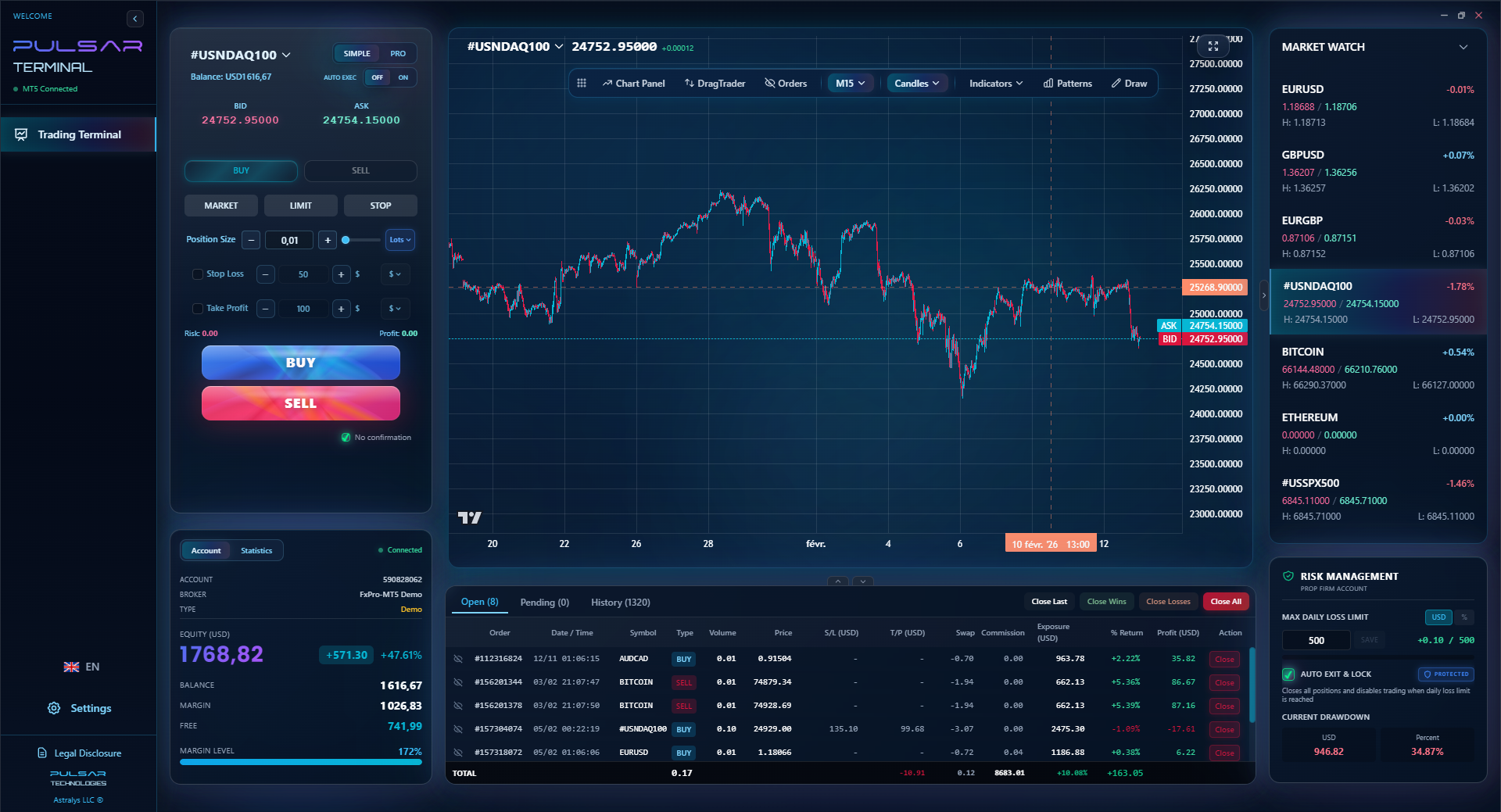
All these calculators are built into Pulsar Terminal with real-time data from your MT5 account. One-click position sizing, automatic risk management, and instant calculations.