
I stared at the perfect bullish engulfing candle on my GBP/NGN chart.

Olumide Adeyemi
서아프리카 트레이딩 선구자 ·  Nigeria
☕ 10 분 소요
배울 내용:
- 1What 'Forex Trade Images' Really Are (And Aren't)
- 2The Unique Picture in the Nigerian Market
- 3How Nigerian Traders Misread the Images (And Blow Up)
- 4Building an Accurate Mental Image: Beyond the Screen
- 5A Practical Chart Setup for a Nigerian Trader in 2026
- 6The Final Image: Taxes and Regulations (The Part Your Broker's Chart Hides)
I stared at the perfect bullish engulfing candle on my GBP/NGN chart. The image was textbook. I'd just finished a course on candlestick patterns, and here was the signal, clear as day on my MT5 platform. I went all in with ₦500,000, convinced the Naira was about to weaken further. Two hours later, a surprise CBN circular hit the wires. The pair reversed 180 pips against me in minutes. My 'perfect' forex trade image had shown me the past, but it was completely blind to the regulatory reality about to unfold. That ₦187,000 loss taught me more about charts than any textbook ever could.
When we talk about forex trade images, we're not just talking about a screenshot of a green candlestick. We're talking about the entire visual story of a market: the chart patterns, the indicator squiggles, the order book depth (if you can see it), and the economic calendar events plotted against price action. It's the map you use to navigate.
But here's the brutal truth most Nigerian traders miss: a forex trade image is a record of past auctions. Every candle shows where buyers and sellers agreed on price at a specific time. It tells you nothing about why they agreed, or what new information will hit the market in the next second. That bullish engulfing pattern on EUR/USD? It just shows that at that period, buying pressure overwhelmed selling pressure. It doesn't know about the US inflation report due in 3 hours.
In Nigeria, we have an added layer. Your chart for USD/NGN might show a steady climb, but that image doesn't reveal the CBN's internal liquidity management, the pressure on BDCs, or the upcoming FAAC allocation that could shift everything. Relying solely on these images is like driving while only looking in the rearview mirror.
Warning: The most beautiful chart pattern in the world is worthless against a central bank intervention. I learned this the hard way with that GBP/NGN trade. My technical image was flawless. My awareness of the regulatory 'landscape' (a word I hate, but it fits) was zero.
Your platform's forex trade images are tools for context, not crystal balls. The real skill isn't in seeing the pattern, it's in understanding what the pattern cannot show you.

💡 윈스턴의 팁
A chart is a fossil. It's the hardened record of past life. Your job is to guess what creature comes next, not worship the bones.
“Your 'perfect' forex trade image shows you the past, but it's completely blind to the regulatory reality about to unfold.”
Trading USD/NGN or EUR/NGN presents a specific set of images you won't see on major pairs. The volatility is different. The gaps are more frequent, especially on Monday mornings or after CBN announcements. The spreads? They can widen to shocking levels during local market stress, a detail your static chart image might smooth over.
Liquidity and Slippage on the Chart
If you're trading Naira pairs, you need to read between the lines of the price image. Low liquidity often shows up as long wicks and frequent spikes. That nice, smooth trend line you drew might get shattered not by a market reversal, but by a single large corporate order hitting a thin market. I once had a stop-loss on USD/NGN that I placed 50 pips away. The chart showed a steady move, but my fill was 120 pips worse. The image didn't show the liquidity hole I fell into.
Regulatory News as a Chart Event
In developed markets, major news creates volatility. In Nigeria, it can create a whole new chart. The CBN's Revised Guidelines in late 2024 didn't just cause a spike, they altered the fundamental structure of the NFEM. A forex trade image from before November 2024 and after are pictures of two different markets. The 56.4% growth in market turnover to $8.6 billion in 2025? That changed the depth behind every candle.
Pro Tip: Always have the CBN website and a reliable financial news feed open NEXT to your trading charts. The chart gives you the 'what.' The news helps you guess the 'why.' Never make a trade on a Naira pair without a quick news check. It's saved me from at least three disastrous trades this year.
This is why using a simple scalping strategy on USD/NGN can be so dangerous. The images look tempting with small ranges, but the slippage risk hidden beneath those candles is massive.
“A forex trade image is a record of past auctions. It tells you nothing about why they agreed, or what new information will hit the market in the next second.”
We are visual creatures. We see patterns everywhere, even in randomness. This is the root cause of most account blow-ups I've seen in Lagos trading communities. Here’s the breakdown.
Mistake 1: Overcomplicating the Picture. You load up your chart with 12 indicators: RSI, MACD, Bollinger Bands, Stochastic, Ichimoku Cloud, you name it. The screen is a rainbow of lines. You're not analyzing anymore, you're just looking for confirmation. If 8 indicators say buy and 4 say sell, you go with the 8. This is garbage. Price is the primary image. Everything else is a derivative, a lagging shadow. I used to do this. My biggest win came when I stripped everything back to price action and volume.
Mistake 2: Ignoring the Time Frame. You see a beautiful double bottom on the 15-minute chart of XAU/USD (gold) and go long. What you didn't do is zoom out. On the 4-hour chart, price is in a brutal downtrend and is just hitting a minor support. You bought a dead cat bounce. The smaller time frame image lied to you because you didn't understand the larger context. Always move from the big picture to the small. Check the weekly, then the daily, then your entry time frame. Our guide on XAU/USD explains how gold moves in trends that dwarf intraday noise.
Mistake 3: Pattern Addiction. Head and shoulders, triangles, flags. We get obsessed. We see a pattern forming and we jump in before the breakout, trying to catch the whole move. More often, the pattern fails. The market doesn't know it's supposed to form a textbook ascending triangle. I've lost count of the 'head and shoulders' patterns that morphed into messy consolidation and went nowhere.
Mistake 4: Forgetting the Spread. Your chart shows a clean breakout. You buy. Instantly, you're 2 pips in the red because of the spread. On a short-term trade, that can be your entire profit margin. That chart image doesn't show the bid/ask spread. You have to know your broker's typical spread on that pair, at that time of day. A broker like IC Markets might show 0.0 pips on raw accounts, but you pay a commission. Others like XM might have a slightly higher spread but no commission. Your mental picture must include this cost.
💡 윈스턴의 팁
If you need more than three indicators to tell you what's happening, you don't understand what's happening. Price is the first and last indicator.
“Overcomplicating your chart is just looking for confirmation, not analysis. Price is the primary image. Everything else is a lagging shadow.”
So how do you build a trading view that doesn't fail you? You combine the visual with the invisible.
First, Multi-Timeframe Analysis. This is non-negotiable. Your process should look like this:
- Weekly Chart: What's the long-term trend? Where are the major support/resistance zones?
- Daily Chart: What is the current momentum within the weekly trend? Identify key daily levels.
- 4-Hour / 1-Hour Chart: Find your potential trade zone. Look for confluences (e.g., a daily support level where the 1-hour chart shows a bullish reversal pattern).
- Entry Timeframe (15-min, 5-min): This is where you fine-tune your entry and place your stop-loss. Not where you find the idea.
Second, Context is King. Before you even look at the chart for EUR/USD today, ask: What day is it? Is it a Monday (range often established) or a Friday (profit-taking)? What major economic events are scheduled? (US Non-Farm Payrolls? ECB speech?). Your EUR/USD guide should be bookmarked for its correlation drivers. For Naira pairs, is there a CBN MPC meeting soon? Has there been a recent circular?
Third, Use the Right Tools. MT4/MT5 are great, but their default charts are basic. Consider tools that add critical information to the image:
- Volume Profile: Shows where most trading activity happened, revealing true support/resistance.
- Market Profile: Similar concept, organizing price by time. These tools show you where the market values price, not just where it's been.
Example: Let's say you're using a position size calculator. You determine you can risk ₦10,000 on a trade. Your chart analysis shows a logical stop-loss 25 pips away on USD/NGN. Your calculator tells you your position size should be $400 (or the Naira equivalent). If you ignore this and just trade 1 lot because the 'image looks good,' you're not trading, you're gambling. That single miscalculation has ended more trading careers than any bad signal.
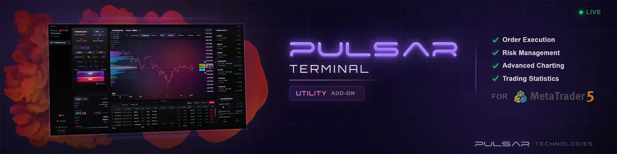
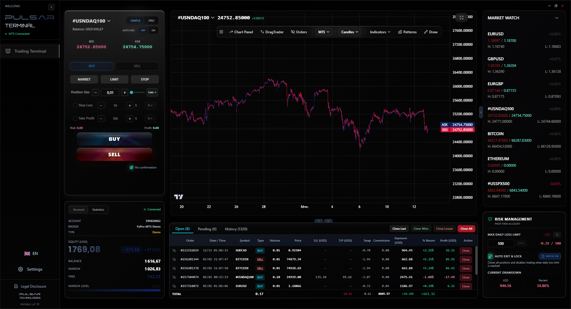
Building a clear trading plan from your chart analysis is one thing, executing it with precision on MT5 is another. Pulsar Terminal's drag-and-drop orders and multi-TP/SL tools let you place your entire trade plan directly onto the chart, turning your analysis into action without misclicks or hesitation.
Pulsar Terminal
MT5 올인원 도구: 드래그앤드롭 주문, 다중 TP/SL, 트레일링 스톱, 그리드 트레이딩, 볼륨 프로파일, 프롭펌 보호. 매일 1,000명 이상의 트레이더가 사용.
“Overcomplicating your chart is just looking for confirmation, not analysis. Price is the primary image. Everything else is a lagging shadow.”
Let's get specific. Here's a clean, effective chart setup I use and teach. It avoids clutter and focuses on high-probability information.
Clean Price Chart: Use a candlestick chart. Choose a neutral background (grey or black) to reduce eye strain.
Key Tools & Indicators (Less is More):
- Simple Moving Averages: Two lines. A fast one (e.g., 21-period) to show short-term momentum and a slow one (e.g., 50 or 100-period) to show the broader trend. Don't use 10 of them.
- Horizontal Support & Resistance Lines: Draw them at clear swing highs and lows on the higher time frames. Keep them clean. Don't have 20 lines on your chart.
- An Economic Calendar Plugin: Have it visible on your screen or in a second monitor. The upcoming events are part of your trade image.
What This Shows You:
- Is price above or below the key moving averages? (Trend)
- Is the fast MA above/below the slow MA? (Momentum)
- Is price approaching a drawn historical level? (Potential reversal/breakout zone)
- Is there a high-impact news event in the next hour? (Reason to stay out or tighten stops)
For Naira Pairs, Add This:
- A permanent note on your chart with the current CBN official rate and the last BDC rate you checked. The divergence between these and your spot rate is a tension meter.
- Be aware of local market hours. Liquidity often dries up in the late Lagos afternoon.
This setup gives you a clear, actionable forex trade image. It tells a story of trend, momentum, key levels, and upcoming risks. It doesn't promise certainty, but it stacks the odds slightly more in your favor. A platform like Pepperstone offers clean MT5 charts that are perfect for this kind of disciplined setup.
💡 윈스턴의 팁
The most important line on your chart isn't a moving average. It's the horizontal line where your stop-loss sits. That's the line that defines your character.
“Ignoring the tax and legal reality can turn a year of technical trading success into a financial and legal nightmare.”
Your trading platform shows glorious green profits. That's one image. The FIRS tax form shows a 10% capital gains tax liability. That's the other image. You must reconcile them.
The 10% Rule: In Nigeria, your net trading profit per year is subject to a 10% Capital Gains Tax. You need to keep careful records. Not just of wins and losses, but of every transaction. Your broker's statement is your starting point, but you are responsible for declaring it.
How to Track It:
- Export Statements Monthly: Don't wait until December. Every month, download your trade history from your broker (like Exness or others).
- Use a Simple Spreadsheet: Columns for Date, Pair, Buy/Sell, Size, Entry Price, Exit Price, P&L in USD, P&L in NGN (at the exchange rate of the day you closed).
- Calculate in Naira: The tax is levied in Naira. You must convert each trade's profit/loss using the official exchange rate on the day you closed the trade. This is a headache, but it's necessary.
The Regulatory Image: Since the ISA 2025, operating an unregistered platform is illegal. This doesn't mean international brokers like HFM or XTB are illegal for you to use. It means the entity offering the service to Nigerians should be registered. Most major international brokers are not physically headquartered in Nigeria, so they operate under their home regulations (FCA, ASIC, CySEC). Your protection comes from those foreign regulators. However, the law emphasizes the need for you, the trader, to verify the broker's legitimacy through proper international licensing. This legal layer is a critical part of your risk management 'image' that no candlestick will ever show you.
Ignoring this final image - the tax and legal reality - can turn a year of technical trading success into a financial and legal nightmare. It's the most important chart of all.
FAQ
Q1What is the best free charting platform for forex trade images in Nigeria?
For pure charting and analysis, TradingView is excellent and widely used by Nigerian traders. For actual trading, MetaTrader 5 (MT5) is the industry standard and free with your broker account. MT5 offers more depth for order execution, while TradingView has superior social features and drawing tools. Many brokers now offer integration between the two.
Q2How do I account for spreads when looking at a chart?
The chart only shows the mid-price. You must mentally add the spread to your risk. If your broker's typical spread on EUR/USD is 1.0 pip, and your chart says your stop-loss is 10 pips away, your real risk is 11 pips. Always check the live spread window before entering a trade, especially on Naira pairs where it can widen. Use a position size calculator that allows you to input the spread for accurate risk calculation.
Q3Why do my chart patterns fail more often in Nigeria?
Market depth and structure. Nigerian forex markets, especially for Naira pairs, have lower liquidity and are more susceptible to sudden regulatory news and large corporate orders. A pattern that works 60% of the time in a deep market like EUR/USD might work only 40-50% of the time in a thinner market because the 'noise' and external shocks are greater. You need a higher confluence of factors (e.g., pattern + key level + supportive time of day) to trade them reliably.
Q4Do I need to pay tax on demo account profits?
No. Capital Gains Tax in Nigeria only applies to real, realized profits. A demo account uses virtual money. However, the moment you switch to a live account and start making real profit, your tax obligation begins from that first trade.
Q5What time frame is best for beginner traders in Nigeria?
Start with the higher time frames. The 4-hour and daily charts. They are less noisy, patterns are more reliable, and you avoid the stress of micromanaging trades every minute. It also forces you to think about bigger trends. Once you're consistently profitable on higher time frames, you can explore lower ones. Jumping straight into 1-minute or 5-minute scalping is a fast track to losing money due to spreads and slippage.
Q6How can I tell if a forex trade image is from a scammer?
Be extremely wary of any image showing: 1) Unrealistically consistent profits (e.g., 10 winning trades a day, every day). 2) A balance that only goes up in a straight line. 3) Trades that always catch the exact top and bottom. 4) Images that hide the account number, broker name, or time/date. Real trading has losses, drawdowns, and periods of stagnation. Anyone showing you a perfect image is selling a fantasy.
Q7Is the RSI or MACD indicator better for Nigerian markets?
Neither is inherently 'better.' They are different tools. The RSI indicator is great for spotting overbought/oversold conditions in a ranging market. The MACD indicator is better for identifying trend changes and momentum. The problem is using them in isolation. In volatile Naira markets, indicators can stay 'overbought' for a long time during a strong trend. Use them as confirming tools alongside price action and support/resistance levels, not as your primary signal.
윈스턴 교수의 수업
핵심 요약:
- ✓Charts show effect, not cause.
- ✓Every pattern has a failure rate >40%.
- ✓The spread is part of every trade's cost.
- ✓10% of profits go to FIRS, always.
- ✓Higher time frames hide less lies.
이 기사가 얼마나 유용했나요?
별을 클릭하여 평가
주간 트레이딩 인사이트
무료 주간 분석 & 전략. 스팸 없음.
저자 소개
Olumide Adeyemi
서아프리카 트레이딩 선구자
나이지리아에서 가장 활발한 외환 트레이딩 교육자 중 한 명. 라고스에서 8년간 트레이딩 경험. 아프리카 트레이더를 위한 소자본 전략과 프롭 펌 챌린지 전문.
댓글
위험 고지
금융 상품 거래에는 상당한 위험이 수반되며 모든 투자자에게 적합하지 않을 수 있습니다. 과거 성과가 미래 수익을 보장하지 않습니다. 이 콘텐츠는 교육 목적으로만 제공되며 투자 조언으로 간주되어서는 안 됩니다. 거래 전에 항상 직접 조사를 수행하십시오.
이 기사도 읽어보세요

Cara Trading Forex Sukses: 7 Prinsip dari Trader Profesional
Cara trading forex sukses dengan 7 prinsip trader pro: manajemen modal, disiplin, journal trading, backtest. Data nyata, bukan janji profit palsu.
Jam Trading Forex Terbaik untuk Trader Indonesia: Panduan Lengkap dengan Tabel Waktu
Panduan jam trading forex untuk trader Indonesia. Tabel 4 sesi dunia, jam emas 20:00-00:00, sesi mana yang harus dihindari. Data akurat + tips dari trader berpengalaman.
Top 5 Sàn Forex Uy Tín Nhất 2026: Review Jujur dari Trader Indonesia
Top 5 sàn forex uy tín 2026 untuk trader Indonesia. Review jujur: spread, deposit, withdraw, dukungan lokal. Exness, XM, IC Markets & lebih.