
Let's get this straight: the forex trading graph on your screen is lying to you.

Olumide Adeyemi
Пионер трейдинга в Западной Африке ·  Nigeria
☕ 12 мин чтения
Что вы узнаете:
- 1What Is a Forex Graph, Really? (It's Not What You Think)
- 2The 3 Biggest Mistakes Nigerians Make With Charts
- 3Reading Price Action: The Naked Chart Method
- 4Choosing Your Timeframe & The Multi-Timeframe Reality Check
- 5A Practical Chart Setup for Nigerian Conditions
- 6From Graph to Trade Plan: Bridging the Gap
- 7When You're Ready: Advanced Concepts (Not Indicators)
- 8Final Word: The Graph is a Tool, Not a Crystal Ball
Let's get this straight: the forex trading graph on your screen is lying to you. It's not showing you the market. It's showing you a heavily processed, delayed, and often manipulated picture of price data. Most traders in Nigeria stare at these charts for hours, drawing lines and hoping for patterns, while their accounts bleed Naira. I did it too. This guide isn't about making the graph look pretty; it's about teaching you to see through the noise, understand what price is actually telling you, and stop getting fooled by every little wiggle. I'll prove that successful trading isn't about predicting the graph, but about reacting to what it reveals.
You open your MT5 platform, and there it is: the candlestick chart for EUR/USD. You think you're looking at 'the market.' You're not. You're looking at a visual report of transactions that have already happened, filtered through your broker's servers. The speed of that data feed, the spread they add, it all changes what you see. In Nigeria, with our sometimes shaky internet, that delay can be the difference between a good entry and a terrible one.
A forex trading graph is just a record of agreement. Each candle shows the highest price someone paid (the high), the lowest price someone accepted (the low), where it opened, and where it closed during a set period. That's it. It doesn't know about the CBN's next policy move or why a big bank in London just sold a billion Euros. It only knows that a trade happened.
Warning: Don't confuse the chart with the auction. The chart is the history book. The live market is the noisy, chaotic auction floor. Trading based solely on the history book means you're always a step behind.
The most common types you'll use are:
- Line Charts: Useless for real trading. They only plot the closing price, hiding all the intra-period struggle. Good for a quick glance, terrible for decisions.
- Bar Charts: A bit better. They show the open, high, low, and close (OHLC) for the period.
- Candlestick Charts: The standard for a reason. They give you the same OHLC data as a bar chart, but the visual 'body' makes market sentiment (bullish or bearish) instantly clearer. This is what you should be trading from.
I learned this the hard way early on. I was trading GBP/NGN using a line chart on a basic platform. I saw a nice uptrend and bought in. What the line didn't show me was that the price was spiking wildly within each hour, and my entry was at the very top of one of those spikes. I was stopped out within minutes. The graph lied by omission.
1. Overcomplicating Everything
This is the epidemic. A new trader opens a chart and immediately slaps on 15 indicators: RSI, MACD, three moving averages, Bollinger Bands, Stochastic... the chart becomes a rainbow-colored mess where you can't even see the price. Indicators are derivatives; they are calculations based on price. If your chart is more indicator than price, you're looking at a calculation of a calculation. Start with a clean chart. Price is king.
2. Chasing Timeframes That Don't Match Your Life
Are you a student with a laptop in class, or do you have a 9-5? If you can't watch the screen every minute, don't try a scalping strategy on a 1-minute chart. You'll get chopped up. I see too many young traders in Lagos trying to scalp during work hours. They lose focus, miss a move, and revenge trade. Pick a timeframe that suits your schedule. For most people with jobs, swing trading on the 4-hour or daily chart is more sustainable.
3. Ignoring the Spread on the Graph
That beautiful candlestick doesn't show you the spread. You might see a support level holding perfectly on the chart, but by the time your market order to buy gets filled, you're already 2 pips in the hole because of the spread. This is crucial in a volatile market like USD/NGN or when trading exotics. Always factor in the cost of doing business. What looks like a 10-pip profit on the graph might be a 3-pip loss in your account after spreads and commissions.
Pro Tip: Before you place any trade, zoom out. Look at the weekly and monthly chart. That 'strong trend' on your 15-minute graph might just be a tiny pullback in a much larger sideways market. Context is everything.

💡 Совет Уинстона
A clean chart is a clear mind. If you can't explain your trade setup in one sentence using only the candles and two lines, you don't have a setup. You have a hope.
“Your forex trading graph is a mirror. It reflects your own discipline, patience, and planning.”
Forget the indicators for a month. I challenge you. Learn to read what the price is telling you directly. This is how you start to see the truth behind the forex trading graph.
Support and Resistance: This isn't just drawing lines. It's identifying price levels where the market has consistently paused or reversed. Look for areas where the price has touched multiple times (at least two clear touches). The more times it tests a level without breaking, the stronger it becomes. Don't draw lines at every minor high and low. Be selective.
Market Structure: Is the market making higher highs and higher lows (uptrend)? Or lower highs and lower lows (downtrend)? Or is it just chopping between two levels (range)? This simple observation will keep you from buying in a clear downtrend just because the RSI is 'oversold.'
Candlestick Patterns (The Useful Few): Most candlestick patterns are garbage in forex. Focus on a handful that show real indecision or momentum shifts at key levels:
- Pin Bars (or Hammer/Shooting Star): A long wick with a small body at the end. Shows a strong rejection of price. A pin bar at resistance after an uptrend? Potential sell signal.
- Engulfing Patterns: A candle that completely 'engulfs' the body of the previous candle. Shows a strong shift in control from buyers to sellers (bearish engulfing) or vice versa.
Here's a real example from my journal. On XAU/USD (Gold), price was in a clear uptrend. It pulled back to a previous resistance level (which had now become support). At that exact level, a bullish pin bar formed on the 4-hour chart. No MACD indicator crossover, no fancy signal. Just price at a key level saying 'not going lower.' I bought. Entry: $1984. Stop loss: $1978 (just below the pin bar's low). Take profit: $1998 (at the next resistance). It worked not because of magic, but because I read the auction's rejection at a logical level.
Your trading timeframe is your decision chart. But you should never make a decision based on just one frame. You need context.
| Timeframe | Good For... | Nigerian Reality Check |
|---|---|---|
| 1M - 15M | Scalping, requires intense screen time. | Nearly impossible with regular power cuts or a busy job. High stress, high broker costs. |
| 1H - 4H | Swing trading, catching intraday trends. | The sweet spot for many. Check charts morning, lunch, and evening. Manageable. |
| Daily - Weekly | Position trading, major trend following. | Requires huge patience and wide stop losses. Capital intensive for proper position size calculator use. |
How to do Multi-Timeframe Analysis (The Right Way):
- Start High (Trend): Go to the Daily or 4H chart. What is the overall trend? Up, down, or range? This tells you the dominant direction. Only take trades in the direction of the higher timeframe trend. It increases your odds dramatically.
- Move to Middle (Timing): Go to your trading chart (e.g., 1H). Look for your setup (support/resistance, pin bar, etc.) in the direction of the higher timeframe trend.
- Finish Low (Precision): Drop to a 15M or 5M chart to fine-tune your entry. Look for a confirming signal on this small frame to get a better entry price.
This process stops you from buying a bullish pattern on the 15-minute chart when the daily chart is screaming bearish. It forces you to trade with the market's weight, not against it.
“Seeing a good pattern is only 20% of the work. The other 80% is having a plan to execute it.”
Given our unique challenges - power, internet, market volatility - here’s a strong setup.
1. Platform & Reliability: Use a broker with a solid mobile app and desktop platform that works well with low bandwidth. Exness review and XM review often perform decently here. Your graph is useless if the platform freezes during a news event.
2. The Core Template:
- Chart Type: Candlestick.
- Color Scheme: Keep it simple. Green/red or hollow candles. Avoid dark backgrounds if you're trading in sunlight.
- Key Tools:
- A horizontal line tool for marking clear support/resistance.
- A trendline tool. Draw from swing point to swing point.
- A simple moving average. Just one. I use a 50-period EMA on the 4H chart to quickly gauge trend. That's it for starters.
3. Dealing with Naira Pairs (USD/NGN, GBP/NGN): These graphs are wild. Spreads are huge, liquidity can be thin. The charts are often less 'clean' than major pairs like EUR/USD guide. You need wider stop losses. A 50-pip move on EUR/USD is a big deal; on USD/NGN, it's breakfast. Never apply the same risk parameters you use for majors to Naira pairs. It's a different beast.
Warning: If you're trading on a smartphone 90% of the time (which many Nigerians do), keep your chart even cleaner. Too many lines and indicators on a small screen is a recipe for misreading price action. Simplify, simplify, simplify.
💡 Совет Уинстона
The most important level on your chart is not support or resistance. It's your stop loss. That's the line that defines your mistake. Everything else is just scenery.
Seeing a good pattern is only 20% of the work. The other 80% is having a plan to execute it. Your forex trading graph should be the source of your plan's inputs.
Step 1: Identify the Setup on the Chart.
- Example: "Bullish pin bar on the 4H chart at the 1.0850 support level, while the daily trend is up."
Step 2: Define Your Trade Mechanics FROM THE CHART.
- Entry Price: Do you enter at the close of the pin bar? On a break of its high? Be specific. (e.g., Buy at 1.0862, a break above the pin bar's high).
- Stop Loss: Place it where the setup is invalidated. For the pin bar, that's below its low. Get the exact price from the chart. (e.g., Stop Loss at 1.0845).
- Take Profit: Aim for the next logical resistance level visible on the same chart. Don't just pick a random number. (e.g., Take Profit at 1.0900, the previous swing high).
Step 3: Calculate Your Position Size. This is non-negotiable. You now know your risk in pips (1.0862 - 1.0845 = 17 pips). Use a position size calculator to determine how many lots to trade so that if you hit that stop loss, you only lose 1-2% of your account. This turns a pretty graph picture into a controlled, mathematical business decision.
Without this bridge, you're just gambling on shapes. I once saw a perfect double top on XAU/USD guide. I sold. I had no plan for where to get out if I was wrong. The price dipped, then screamed back up. I held, hoping it would turn back down. It didn't. I turned a 10-pip potential profit into a 50-pip loss because the graph gave me a signal, but I had no plan to manage it.
“The graph isn't the truth, but if you know how to interrogate it, it will give you enough clues to place smart bets.”
Once you're comfortable with naked price action, you can explore these concepts that add depth to your graph analysis.
Order Blocks & Fair Value Gaps: These are concepts from the ICT (Inner Circle Trader) methodology that have gained popularity. They look for specific imbalances or 'gaps' in price on a lower timeframe that can act as magnets or support/resistance. It's a more nuanced way of looking at market structure.
Volume Profile: This isn't an oscillator. It shows you where most of the trading volume occurred at specific price levels over a chosen period (a day, a week). It helps you identify truly significant support/resistance zones (High Volume Nodes) and low-volume areas where price can move fast (Low Volume Nodes). This is powerful for understanding why price gets stuck in certain areas.
Market Profile: Similar idea, but it organizes price by time. It helps you see the market's developing value area for the day. These tools are about understanding the auction process behind the candles, not predicting the next candle.
The Prop Firm Angle: If you're aiming for a prop firm challenge, your chart reading needs to be disciplined. They have strict drawdown rules. This means your stop losses must be precise and based on the chart, not a hope. A tool that can help manage multiple trades and set breakeven stops automatically can be a lifesaver under pressure.
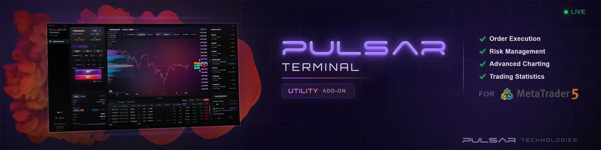
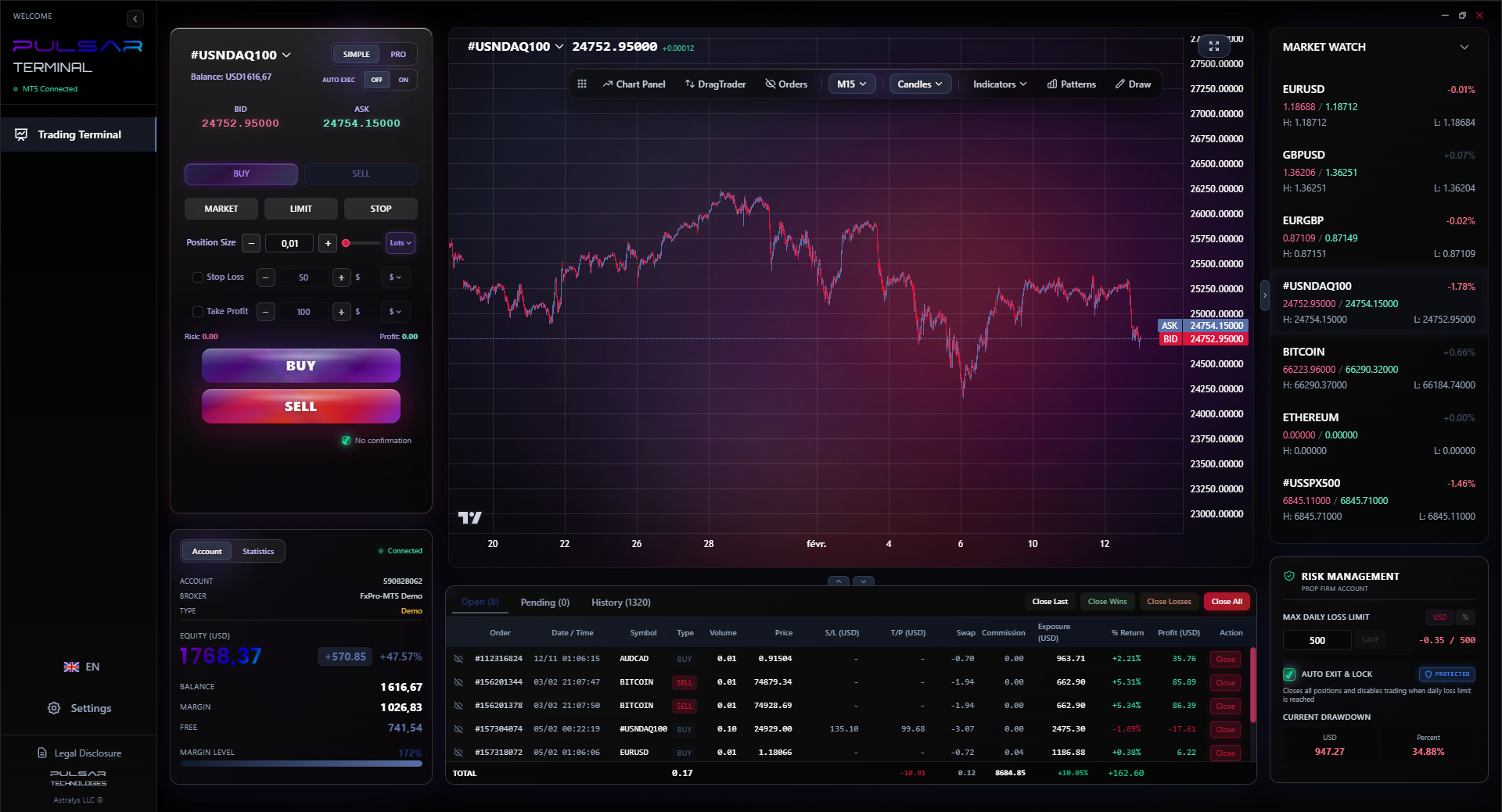
Managing multiple trades and protecting profits under prop firm rules is stressful, but tools like Pulsar Terminal automate breakeven stops and multi-level take profits directly on your MT5 chart.
Pulsar Terminal
Универсальный инструмент для MT5: drag-and-drop ордера, мульти-TP/SL, трейлинг-стоп, грид-трейдинг, Volume Profile и защита для проп-фирм. Используется 1000+ трейдерами ежедневно.
The goal is not to find the perfect indicator or the secret pattern. The goal is to develop contextual awareness. A pin bar means nothing in the middle of nowhere. A pin bar at a key daily support level in an uptrend means a lot.
Your forex trading graph is a mirror. It reflects your own discipline, patience, and planning. A cluttered, messy chart usually means a cluttered, messy trading mind. A clean chart with clear levels and a defined plan reflects a trader who understands that this is a probability business.
Stop looking for the graph to tell you what will happen. Start using it to identify: 1) Where is the market? 2) What is the context? 3) What is my plan if it goes here, or there? That shift in perspective - from fortune-teller to risk manager - is what separates the consistent Nigerian trader from the one funding the broker's next bonus. The graph isn't the truth, but if you know how to interrogate it, it will give you enough clues to place smart bets.
FAQ
Q1What is the best timeframe for forex trading in Nigeria?
There's no single 'best,' but the 1-hour and 4-hour charts are the most practical for most Nigerians. They don't require glued-to-the-screen attention, fit around work schedules, and provide enough movement to capture meaningful swings without the extreme noise of lower timeframes. Avoid scalping on 1-minute charts unless it's your full-time job with a rock-solid internet connection.
Q2How do I know if a support or resistance level on the graph is strong?
Look for two things: multiple touches and time. A price level that has been tested and held 3-5 times over weeks or months is stronger than one touched once. Also, watch how price reacts there. A sharp rejection (long wick) shows strength. A slow, grinding approach and break might indicate a weaker level. The weekly chart shows the strongest levels.
Q3Why do my trades look good on the graph but I still lose money?
Three main reasons: 1) The Spread: Your chart doesn't show the bid/ask spread. You're instantly in the red on entry. 2) Slippage: In fast markets, your fill price is worse than the chart price you saw. 3) Psychology: You saw the setup, but you entered late, moved your stop loss, or took profit too early. The graph shows the perfect path; your execution was human.
Q4Is technical analysis on forex graphs even reliable for the Nigerian Naira (NGN) pairs?
It's less reliable than for major pairs like EUR/USD. USD/NGN is heavily influenced by CBN policy, local dollar liquidity, and political news, which can cause massive, chart-breaking gaps and spikes. Technical levels can work, but you must use much wider stop losses and be aware that fundamental shocks can override any pattern instantly. Trade them with smaller size.
Q5How many indicators should I have on my trading graph?
Start with zero. Master price action and drawing support/resistance lines first. Once proficient, you might add one or two momentum or trend-following indicators for confluence - like the RSI indicator to spot overbought/oversold conditions at your key levels. If you have more than two, you're likely overcomplicating and creating conflicting signals.
Q6What should I do when the power goes out and I have an open trade?
This is a critical part of Nigerian trading. Always use a stop loss. Always. Before you enter a trade, know your exit point. Use a broker with a reliable mobile app so you can quickly check/manage trades from your phone with data. Consider trading longer timeframes (4H/Daily) so a 1-hour power cut doesn't panic you. Your trade plan must survive grid failure.
Q7Do I need to pay for special charting software as a beginner in Nigeria?
Absolutely not. The free MetaTrader 4 or 5 platforms from most brokers offer all the charting tools you need for years. Paid software adds advanced features like better volume tools or backtesting, but they won't make you a profitable trader. Skill comes from practice on a simple chart, not from buying expensive tools. Master the free stuff first.
Урок проф. Уинстона
Ключевые выводы:
- ✓Price action on a clean chart beats a dozen lagging indicators.
- ✓Always calculate position size based on the chart's stop distance.
- ✓Trade Naira pairs with 3x the normal stop-loss tolerance.
- ✓The higher timeframe trend direction is your biggest ally.
Насколько полезна эта статья?
Нажмите на звезду
Еженедельные торговые инсайты
Бесплатный еженедельный анализ и стратегии. Без спама.
Об авторе
Olumide Adeyemi
Пионер трейдинга в Западной Африке
Один из самых активных преподавателей форекс-трейдинга в Нигерии. 8 лет торгового опыта из Лагоса. Специализируется на стратегиях с малым капиталом и челленджах проп-фирм для африканских трейдеров.
Комментарии
Предупреждение о рисках
Торговля финансовыми инструментами сопряжена со значительным риском и может не подходить всем инвесторам. Прошлые результаты не гарантируют будущих доходов. Данный контент носит исключительно образовательный характер и не является инвестиционной рекомендацией. Всегда проводите собственное исследование перед торговлей.
Вам также может понравиться

Cara Trading Forex Sukses: 7 Prinsip dari Trader Profesional
Cara trading forex sukses dengan 7 prinsip trader pro: manajemen modal, disiplin, journal trading, backtest. Data nyata, bukan janji profit palsu.
Jam Trading Forex Terbaik untuk Trader Indonesia: Panduan Lengkap dengan Tabel Waktu
Panduan jam trading forex untuk trader Indonesia. Tabel 4 sesi dunia, jam emas 20:00-00:00, sesi mana yang harus dihindari. Data akurat + tips dari trader berpengalaman.
Top 5 Sàn Forex Uy Tín Nhất 2026: Review Jujur dari Trader Indonesia
Top 5 sàn forex uy tín 2026 untuk trader Indonesia. Review jujur: spread, deposit, withdraw, dukungan lokal. Exness, XM, IC Markets & lebih.
Скачать Pulsar Terminal
Все эти калькуляторы встроены в Pulsar Terminal с данными в реальном времени с вашего счёта MT5.
Скачать Pulsar Terminal