
Most traders in Nigeria are looking at charts all wrong.

Olumide Adeyemi
西非交易先驱 ·  Nigeria
☕ 9 分钟阅读
您将学到:

Most traders in Nigeria are looking at charts all wrong. They pile on indicators, chase every blip, and wonder why their account is always on life support. The truth is, successful forex charts analysis isn't about finding a magic setup. It's about understanding the story price is telling you, in its own language. I've blown accounts trying to outsmart it, and I've built them back up by learning to listen. This guide will show you how to do the same.
Forget the news headlines from abroad for a second. By the time you read about a central bank decision on Nairaland, the market has already moved. The chart is the only thing that shows you what large institutions and other traders are actually doing with their money, right now. It's the collective footprint of every fear, greed, and calculation in the market.
When I started, I'd try to trade based on logic. "The Naira is weak, so USD/NGN should go up," I'd think. But sometimes it wouldn't. The chart showed me that all the "smart money" had already positioned for that move weeks before. My analysis was late. The chart is real-time. It doesn't lie, though it can be tricky to interpret.
Your job isn't to predict the future. It's to read the probability of what might happen next based on the current price action. Everything else - fundamentals, sentiment, broker rumors - is just noise until it shows up on the chart. This is the core of all effective forex charts analysis.
“The chart is the only thing that shows you what large institutions are actually doing with their money, right now.”
If charts are a book, candlesticks are the letters. You need to know them cold. Each candle tells you the open, high, low, and close for a specific period (like 1 hour or 1 day).
The Body and The Wicks
The thick part is the body. It shows the battle between buyers and sellers during that period. A long green body means buyers were strong and in control from open to close. A long red body means sellers dominated.
The wicks (or shadows) are the extremes. A long upper wick on a red candle tells you buyers tried to push price up, but sellers smashed it back down to close near the low. That's a sign of rejection.
Warning: Don't trade single candlestick patterns in isolation. A "hammer" or "shooting star" means nothing unless it forms at a key level of support or resistance. I learned this the hard way, taking every hammer as a buy signal and getting stopped out repeatedly.
A Pattern That Actually Works
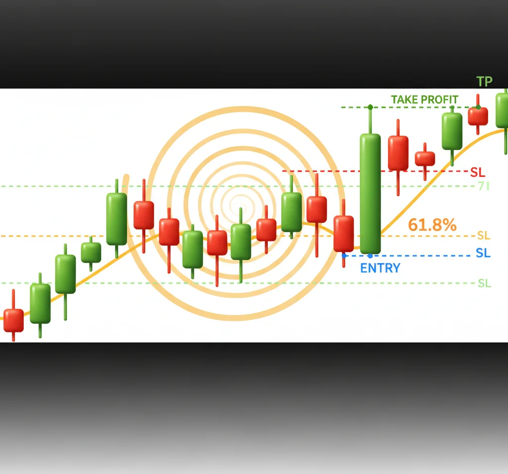
One of the few reliable multi-candle patterns is the engulfing pattern. A bullish engulfing happens when a green candle's body completely 'engulfs' the body of the previous red candle. It signals a potential reversal from down to up, especially if it happens after a downtrend. I caught a nice move on GBP/USD with this in 2022. Price had been falling, formed a bullish engulfing right at a major support level I had marked, and I entered at 1.1750. I rode it for about 180 pips. The key was the context - the trend and the level.
“Your first question on any chart should be: what's the trend?”
This is the oldest saying in trading because it's the most important. In Nigeria, with our volatile market hours and sometimes shaky internet, trying to pick tops and bottoms is a surefire way to lose. Your first question on any chart should be: what's the trend?
How to Spot a Trend
Uptrend: A series of higher highs (HH) and higher lows (HL). Draw a line connecting the lows - that's your rising support or trendline.
Downtrend: A series of lower highs (LH) and lower lows (LL). Draw a line connecting the highs - that's falling resistance.
Range (No Trend): Price is bouncing between a clear support and resistance level. This is common before big news events.
I used to hate ranging markets. I'd get chopped up buying at resistance and selling at support. Now, I just walk away or trade very small. My biggest wins have always come from strong, clear trends. For example, during the USD bull run in 2023, simply waiting for pullbacks to a moving average in an uptrend on EUR/USD provided high-probability entries. A good swing trading approach thrives on this.
Pro Tip: Zoom out! Nigerian traders often stare at the 5-minute chart. Switch to the 4-hour or daily chart to see the real trend. What looks like a buying opportunity on the 15-minute chart might be a tiny pullback in a massive daily downtrend.

💡 Winston 小贴士
A clean chart is a thinking chart. If you can't see the price action clearly because of lines and indicators, you're not analyzing, you're decorating.
“Your first question on any chart should be: what's the trend?”
Price has memory. Where it has reversed before, it is likely to pause or reverse again. These are your support (floor) and resistance (ceiling) levels.
How to Draw Them: Look for areas where price has touched multiple times and reversed. The more touches, the stronger the level. Don't get too precise - draw them as zones, not single lines.
A break of a strong resistance level often turns it into new support (and vice versa). This is called a role reversal and is a powerful concept. I remember trading XAU/USD (Gold) when it broke above $1800, a level that had held as resistance for months. After the break, it pulled back to $1795-$1800, found support (the old resistance), and then rocketed higher. That pullback to the breakout zone was a gift of an entry.
These levels are where you want to place your trades. Buying near support in an uptrend, selling near resistance in a downtrend. It gives you a clear point to be wrong (if the level breaks). Never, ever place a trade without knowing where your nearest key level is. It's the foundation of risk management and should be part of your pre-trade checklist with a position size calculator.
“I've seen charts so cluttered you can't even see the price. This is a trap.”
We love our indicators in Nigeria. I've seen charts so cluttered with moving averages, RSI, MACD, and Bollinger Bands that you can't even see the price. This is a trap. Indicators are lagging - they are calculated from past price. They confirm what has already happened.
The Only Two You Really Need
-
A Moving Average (or two): I use the 50-period and 200-period Exponential Moving Average (EMA) on the daily chart. The 200 EMA is the granddaddy trend filter. If price is above it, the long-term trend is up. The 50 EMA often acts as dynamic support in an uptrend. A crossover of the 50 above the 200 (a Golden Cross) can signal a major trend change, but it's slow.
-
The RSI for Extremes: The RSI indicator is useful for one thing: spotting overbought or oversold conditions in a ranging market. If the trend is strong up, RSI can stay overbought for weeks. Don't use it to counter-trend a strong move. Use it to anticipate a pullback to a key level.
I once lost $400 on a trade because the MACD indicator gave a 'bearish crossover' on the 1-hour chart, but I ignored the fact that price was in a roaring uptrend on the 4-hour and was sitting right on a major support zone. The indicator was right for about 20 pips, then the trend resumed and took out my stop loss. The lesson? Price and levels first, indicators second.
💡 Winston 小贴士
The most important level on your chart is not support or resistance. It's your stop loss. That's the line that defines your relationship with a trade.
“I've seen charts so cluttered you can't even see the price. This is a trap.”
Here’s my daily routine. It takes 20 minutes, max.
- The Big Picture (Daily Chart): Identify the primary trend using HH/HL or LH/LL. Mark the major support and resistance zones. Note where the 200 EMA is.
- The Trading Timeframe (4-Hour or 1-Hour Chart): Within the daily trend, what is the trend on this chart? Are we in a pullback? Mark the more immediate S&R levels.
- The Entry Timeframe (15-Minute or 5-Minute Chart): This is where you look for your entry trigger. You want your trigger (like a candlestick pattern or a break of a minor level) to align with the direction of the higher timeframe trend, and ideally be near a higher timeframe support or resistance.
Example Trade Setup:
- Daily Chart: Strong uptrend, price pulling back towards the 50 EMA.
- 4-Hour Chart: Downtrend (the pullback), approaching a major support zone drawn from the daily chart.
- 15-Minute Chart: Price reaches the support zone, forms a bullish engulfing candle or a pin bar. That's your entry signal.
You place your stop loss just below the support zone. Your take profit is towards the next resistance zone up. This is the essence of multi-timeframe forex charts analysis.
Example: Let's say your risk is 50 pips (stop loss distance). You use a position size calculator and decide to risk 1% of your $1000 account, which is $10. $10 / 50 pips = $0.20 per pip. For a standard lot (where 1 pip = $10), that means your position size should be 0.02 lots. This discipline keeps you in the game.
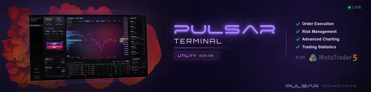
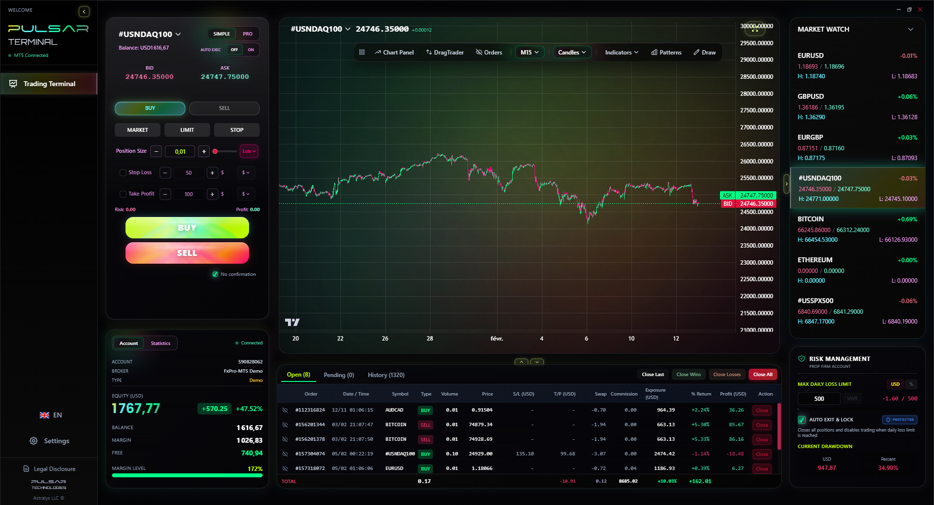
Once your chart analysis gives you a signal, executing and managing the trade cleanly is half the battle, which is where a tool like Pulsar Terminal for MT5 shines.
Pulsar Terminal
MT5一站式工具:拖拽下单、多重止盈/止损、追踪止损、网格交易、成交量分布图和自营交易保护。每日1000+交易者使用。
“If your level is broken, you're wrong. Take the loss.”
Let's keep this real. Here's where I've sent money to smarter traders.
- Analysis Paralysis: Staring at charts for hours, drawing 100 lines, and taking no trades. Decide on a simple system and stick to it. A clean broker platform like IC Markets or Pepperstone helps avoid clutter.
- Ignoring the Trend on Higher Timeframes: This was my biggest killer. A beautiful buy setup on the 5-minute chart means nothing if the daily is screaming down.
- Moving Stop Losses Further Away: Your trade is losing, so you move your stop loss to "give it room." This is just delaying a loss and usually making it bigger. If your level is broken, you're wrong. Take the loss.
- Trading During Low Liquidity: The worst time for a Nigerian trader? Late night or early morning our time. Spreads widen on brokers like Exness or XM, and price can slip easily. Stick to London and New York overlaps if you can.
- Revenge Trading: After a loss, you jump right back in to "make it back." Your emotions are in charge. Walk away. The charts will be there tomorrow.
I've violated every one of these rules. The result was a series of margin calls that took years to recover from emotionally and financially. Learn from my pain.
FAQ
Q1What's the best chart timeframe for beginners in Nigeria?
Start with the 4-hour chart for trend analysis and the 1-hour chart for entries. It's slow enough to avoid market noise and fast enough to see opportunities within a week. Avoid the 1-minute and 5-minute charts when starting - they are a fast track to emotional burnout.
Q2How many indicators should I use on my chart?
As few as possible. Seriously, one or two is plenty. I know traders making consistent money with just price action, support/resistance, and a single moving average. More indicators just give you conflicting signals and confuse you.
Q3Can I make money trading forex in Nigeria with just chart analysis?
Yes, absolutely. Chart analysis is the core skill of technical trading. However, you must combine it with strict risk management (position sizing, stop losses) and solid psychology. The chart gives you the 'where' and 'when,' but discipline determines your profit or loss.
Q4Why do my support and resistance lines keep getting broken?
They're not supposed to be rigid lines. Think of them as zones or bands. Also, no level holds forever. A break of a major level is a significant event and often leads to a strong move. If a level gets tested 5 or 6 times, it's weakening and more likely to break.
Q5Is candlestick analysis reliable for forex?
Single candlesticks, not very. But candlestick patterns in the right context - like at a key support/resistance level or confirming a trend - are extremely reliable. They show the immediate sentiment and battle between buyers and sellers at a critical point.
Q6How do I know if a trend is ending?
Look for failure of the pattern. In an uptrend, watch for a lower high (LH) to form. That's the first sign of weakness. If price then makes a lower low (LL), the uptrend is likely over and may be reversing into a downtrend or a range.
Q7What charting platform is best for Nigerian traders?
MetaTrader 4 or 5 (MT4/MT5) is the global standard and offered by almost all brokers serving Nigeria, like XM and IC Markets. It's reliable, has every tool you'll need, and a massive library of free indicators. Focus on mastering one platform.
Winston 教授的课程
要点总结:
- ✓Zoom out to see the real trend on higher timeframes.
- ✓Draw support/resistance as zones, not single lines.
- ✓Use 1-2 indicators max; price action is king.
- ✓Always know your stop loss before you enter.
这篇文章对您有用吗?
点击星星评分
每周交易洞察
免费每周分析与策略。无垃圾邮件。
关于作者
Olumide Adeyemi
西非交易先驱
尼日利亚最活跃的外汇交易教育者之一。从拉各斯出发有8年交易经验。专注于低资金策略和面向非洲交易者的自营公司挑战。
评论
风险提示
金融工具交易存在重大风险,可能不适合所有投资者。过往业绩不代表未来表现。本内容仅供教育目的,不构成投资建议。在交易前请务必自行研究。
您可能还喜欢

Cara Trading Forex Sukses: 7 Prinsip dari Trader Profesional
Cara trading forex sukses dengan 7 prinsip trader pro: manajemen modal, disiplin, journal trading, backtest. Data nyata, bukan janji profit palsu.
Jam Trading Forex Terbaik untuk Trader Indonesia: Panduan Lengkap dengan Tabel Waktu
Panduan jam trading forex untuk trader Indonesia. Tabel 4 sesi dunia, jam emas 20:00-00:00, sesi mana yang harus dihindari. Data akurat + tips dari trader berpengalaman.
Top 5 Sàn Forex Uy Tín Nhất 2026: Review Jujur dari Trader Indonesia
Top 5 sàn forex uy tín 2026 untuk trader Indonesia. Review jujur: spread, deposit, withdraw, dukungan lokal. Exness, XM, IC Markets & lebih.